ROLE
CLIENT
Wondercraft.ai
Detailed view
TL:DR
Background
Wondercraft started as an AI audio platform and shifted into AI video. The shift exposed a problem that wasn't visible in the audio product. Video generation costs more, takes longer, and produces less predictable results than audio. Stack those three things and you get an experience where every "Generate" button press feels like a bet. Users were spending credits without knowing whether they'd get something usable, waiting 10+ minutes per generation, and often discovering only at the end that the result wasn't what they wanted.
I led the design work to reduce the uncertainty in this experience and rebuild user confidence in the platform during the video transition.
The problem
A typical 2-minute video production on Wondercraft combined images, video clips, voice, and text. The average wait for that production to finish was over 10 minutes. During those 10 minutes, users had no choice but to wait. Closing the browser cancelled the generation entirely, which meant if the result came back poorly the user had spent both the time and the credits with nothing to show.
The credit pressure made this worse. A Creator plan offered 1000 credits per month. A single production could consume that entire allowance in one generation. Pro plans were larger (2,000, 4,000, 6,000) but the underlying cost structure didn't change. Users were watching their monthly budget disappear in a single click without certainty that the output would be usable.
This wasn't a UX problem in the conventional sense. It became an emotional design problem as every interaction had a stake attached to it, and the platform was doing nothing to acknowledge or soften that.
Who I was
designing for
Three user types were affected, all in different ways but with the same underlying anxiety.

Casual creators
Working on personal projects (a YouTube video about personal finance, for example) had the tightest credit budgets and the highest emotional investment per generation. Burning their monthly allowance on a single failed attempt was a real risk.

HR and L&D
Producing internal training content needed reliability and consistency more than creative freedom. Unpredictable output made it hard to commit to using the platform for anything time-sensitive.

Creative agency users
Producing client work (a short social ad for a beverage brand, for example) had higher budgets but the lowest tolerance for inconsistency. A regenerated clip that looked completely different from the previous one broke their workflow entirely.
Research
I synthesised findings from 17 trial customer debrief calls across all three user types. The same themes came up consistently.
"I used my entire plan credits in one generation."
"Too long to see something and barely usable content."
"I couldn't even produce one project. I was asked to upgrade midway through generation."
The themes clustered into four findings:
Cost anxiety scaled with project complexity, not just credit count. A multi-asset production wasn't 10x more expensive than a single asset. It was 10x more anxious. Users were calculating their downside the whole way through.
Inconsistency made the waits feel longer. Users could tolerate a long wait if they trusted the result. They couldn't tolerate a long wait that ended in a regeneration. The combination of uncertainty plus duration was multiplicative, not additive.
The page-close problem trapped users in the experience. Closing the browser cancelled generations, so users sat watching loading bars for 10+ minutes instead of working on something else. The wait felt longer because it was forced.
Credit messaging was making things worse. Every credit warning the platform showed was framed as a cost ("Your next message will cost X"). Every prompt to optimise was framed as a problem with the user ("You're using too much context"). The language of the product was adding to the anxiety it was trying to address.
The solution
Three design decisions did most of the work.
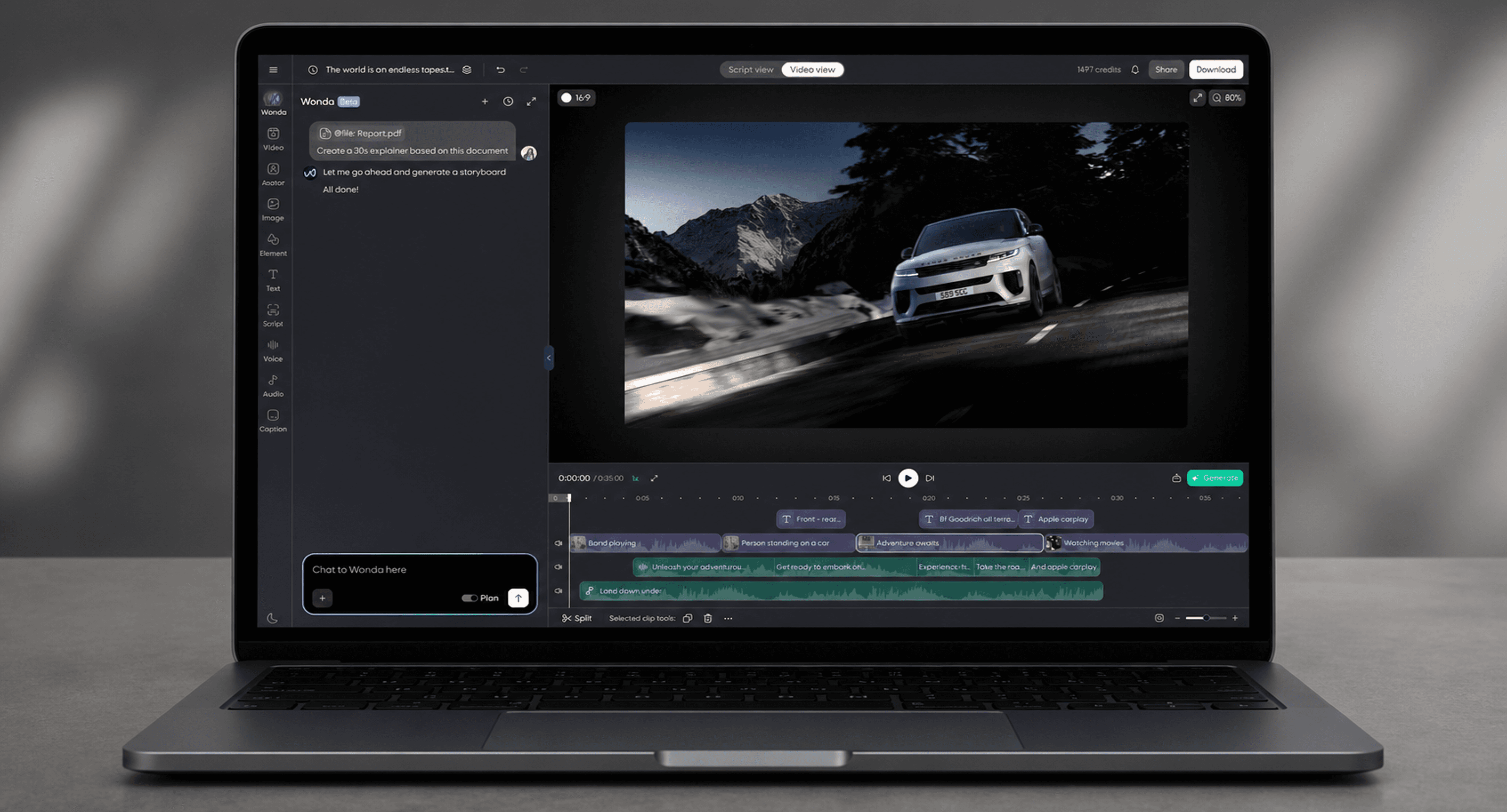
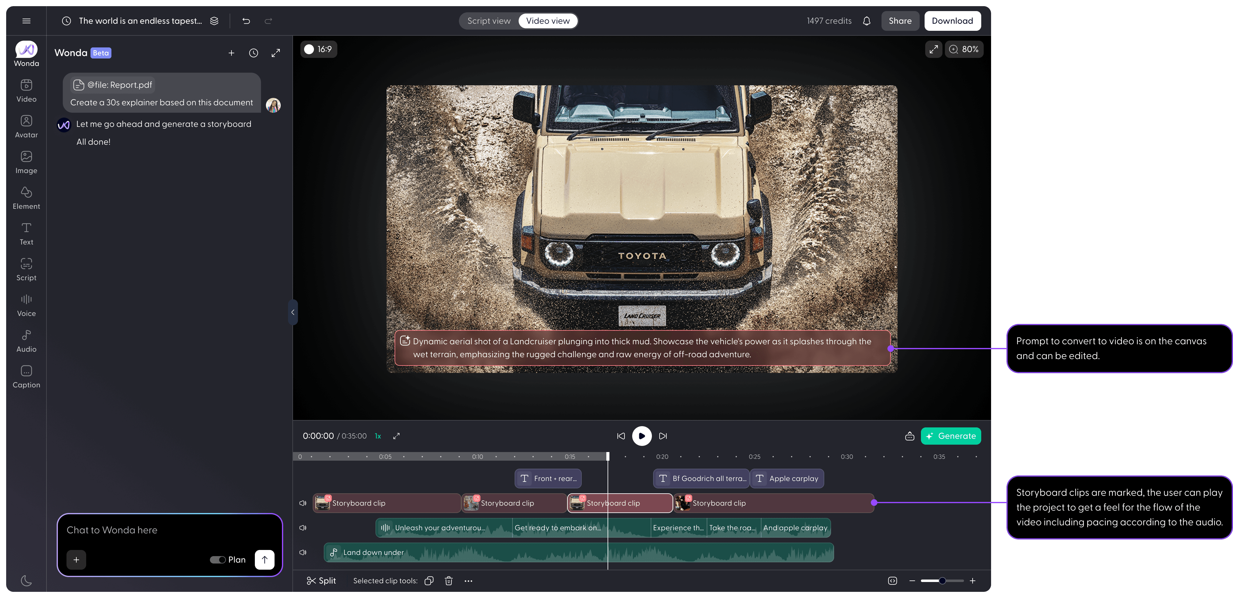
Storyboard clips: generate the starting frame, not the video
The team's initial instinct was to switch to cheaper text-to-video models for cost reduction. I pushed back. Lower-quality models aren't meaningfully cheaper at the level Wondercraft was operating at, and once a user is happy with their draft and wants to render in higher quality, the higher-quality model produces a completely different result. The user's iteration work gets thrown away every time they upgrade.
The alternative the team considered was a hand-drawn storyboarding view, which would have been cheap but had no resemblance to the final video output. Users would still be guessing at the result.
The solution I designed was storyboard clips. Instead of generating a full video clip per scene, the platform generates a single starting frame image and a prompt for what happens next. The user sees the actual first frame of the scene, they can edit the starting image or prompt, and only commits to image-to-video generation once they're happy with how the scene starts and how the pacing of the production looks.
The cost difference is significant. Text-to-image generation costs roughly 15-20x less than text-to-video at comparable quality tiers across the industry. For a 1-minute production (10 clips), starting frames cost around 32 credits in total versus 500+ credits for the equivalent text-to-video generations. That means users can iterate on starting frames around 15 times for the cost of a single text-to-video pass. And because the starting frame is the actual first frame of the final video, iteration work carries through to the final render rather than being discarded.
Reframe credit messaging from cost to saving

The chat editing feature carried credit context that grew with each message in the conversation. Beyond a certain point, the cost-per-message started to become significant. The team's default was to show users a message saying "Your next message will cost at least X credits. Start a new chat to keep costs low."
The estimation was not very useful as not knowing what the next message will be means we don't know what will be the actual cost so I reframed it. The new message reads: "Start a new chat to save 67 credits of context. You can also compress context to reduce cost."
The change is small but the psychological shift is large. The original message reminds the user that the platform is expensive every time they want to send a message. The reframed message offers them a way to save money.
This decision sat inside a broader push I made on credit transparency. The team wanted to show credit warnings frequently to make sure users were aware of their usage. I argued that constant credit reminders make using the platform feel like watching a meter run. The rule I set was that any credit-related messaging needed to pass two tests: was it actionable, and was it the minimum frequency required to communicate the information. Anything that failed either test got removed.

Make the wait transparent and the user free to leave
The long wait wasn't going to disappear. The storyboard clips approach shortened it considerably (only first frames generate up front) but it didn't eliminate it. The design problem was making the wait feel like something other than dead time.
Two things came out of this. The first is a streamed action feed during generation. As the model works, it surfaces what it's doing in plain language so the user can follow the progress rather than stare at a spinner. The canvas itself animates the project into view scene by scene, with the first frame slowly un-blurring as it's prepared. Because the starting frames are already generated by this point, this can be staged to look smooth and intentional rather than chaotic.
The second is a "notify when complete" option. Users can close the page (or navigate elsewhere in the platform) and get pinged when the generation finishes. New users can explore the platform during their first wait. Returning users can work on a different project.
Press play to see a sped up version of the animation and process.
Impact
Status: Shipped four months ago.
~15x more iterations possible at storyboard stage vs full video
Storyboard clips reframed the cost equation. A user can now iterate on a 1-minute production roughly 15 times at the storyboard stage for the credit cost of a single full text-to-video generation pass. The iteration work also carries through to the final render because the starting frame is the actual first frame of the final clip.
84% of users started a new chat to save credits
Across two weeks of usage, 84% of users who saw the "Start a new chat to save X credits" message clicked through to start a new chat. Of those only 4% used the compress-context option. The behaviour suggests the message is doing its job, and also raises the question of whether we should be asking at all rather than auto-managing context for users.
The loading state design changed how users related to the wait
Qualitative feedback in subsequent calls described the loading experience as feeling like watching something happen rather than waiting for something to finish. On the behaviour side, 80% of users kept the page open on their first generation. That dropped to 42% on follow-up generations, which I read as users learning they could trust the notify-when-complete option and choosing to work on other things in parallel.
What I learned
The instinct on a product with usage anxiety is to make the cost smaller. The harder and more interesting design move is to address what the cost feels like.
The storyboard clips work did genuinely reduce cost, but the bigger result was that it gave users a moment of certainty before committing. The reframed credit message didn't save anyone any money on its own. It just removed a recurring source of negative reinforcement. The loading state animation didn't shorten any waits, but it changed the perceived value of the time spent waiting.
The lesson I keep coming back to: when a product makes users anxious, the design problem is almost never the literal thing they're complaining about. It's the underlying loss of control. Restore the control, even partially, and the anxiety follows it down.