ROLE
Lead Product Designer
CLIENT
Origin Markets

Detailed view
TL:DR
Background
Origin Markets is a debt capital markets platform handling the entire lifecycle of a bond issuance, from pricing through to trade documentation and listing. When I joined the project, legal users responsible for preparing documents were quietly abandoning the platform mid-workflow: downloading documents, editing in Word, then re-uploading changes. They were doing the work twice. And they were telling issuer and dealer clients that Origin was slower and more expensive than just using email and Word.
That’s not a UI problem. That’s a product built around assumptions about how users work that turned out to be wrong.
The problem
Post-trade debrief calls with users surfaced three things consistently. Each one traced back to a design decision that made sense in theory and failed in practice.
~ 50 emails per trade were going out and the open rate was 8.5%. The review sequence was fixed and linear. One person held the pen at a time, with no clarity on who, when, or what happened to someone else’s work if you took over.
The platform wasn’t missing features. It was making the wrong assumptions about how legal teams, dealers, and issuers actually collaborate on a trade.
Who I was
designing for
Three personas interact with trade documents on Origin, each with a different relationship to the problem.

Dealer
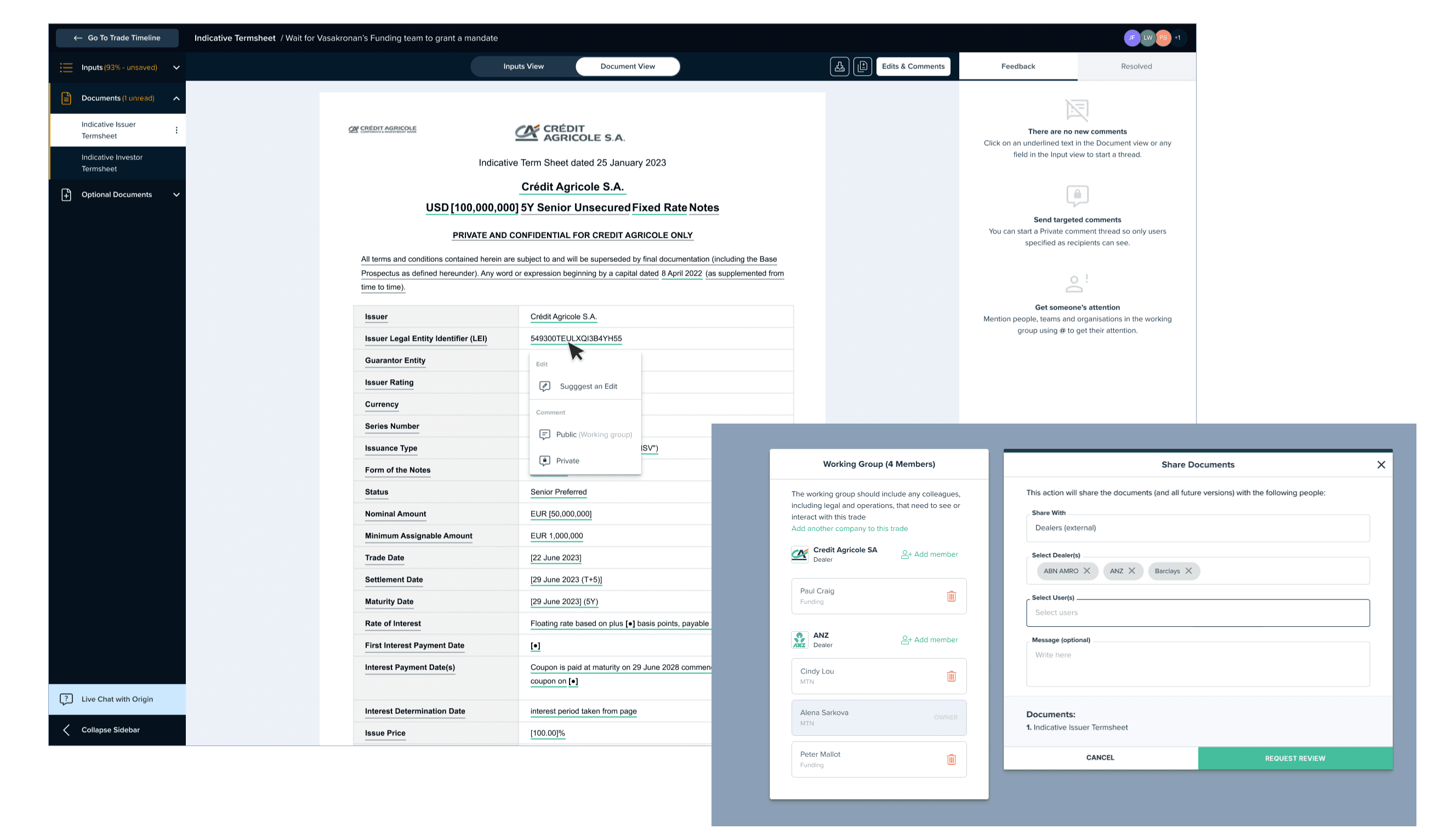
The dealer owns the document from the start of the trade. They’re the sole editor, the penholder, which means any time they step away the whole process stalls. They were also the ones manually chasing reviewers by email outside the platform because Origin’s notifications weren’t giving people enough reason to log in.

Issuer
Issuers are used to Word. If they spot something that needs changing they want to fix it themselves and notify the dealer, not wait for the dealer to make the change on their behalf. The single-editor model made even minor changes a coordination exercise.

Legal Counsel
Legal teams review documents under tight deadlines with high volumes of back-and-forth. They were the most likely to abandon the platform entirely. Their workflow, drafting all comments, reviewing together, then submitting, didn’t fit the real-time commenting model Origin had built.
What the research
told me
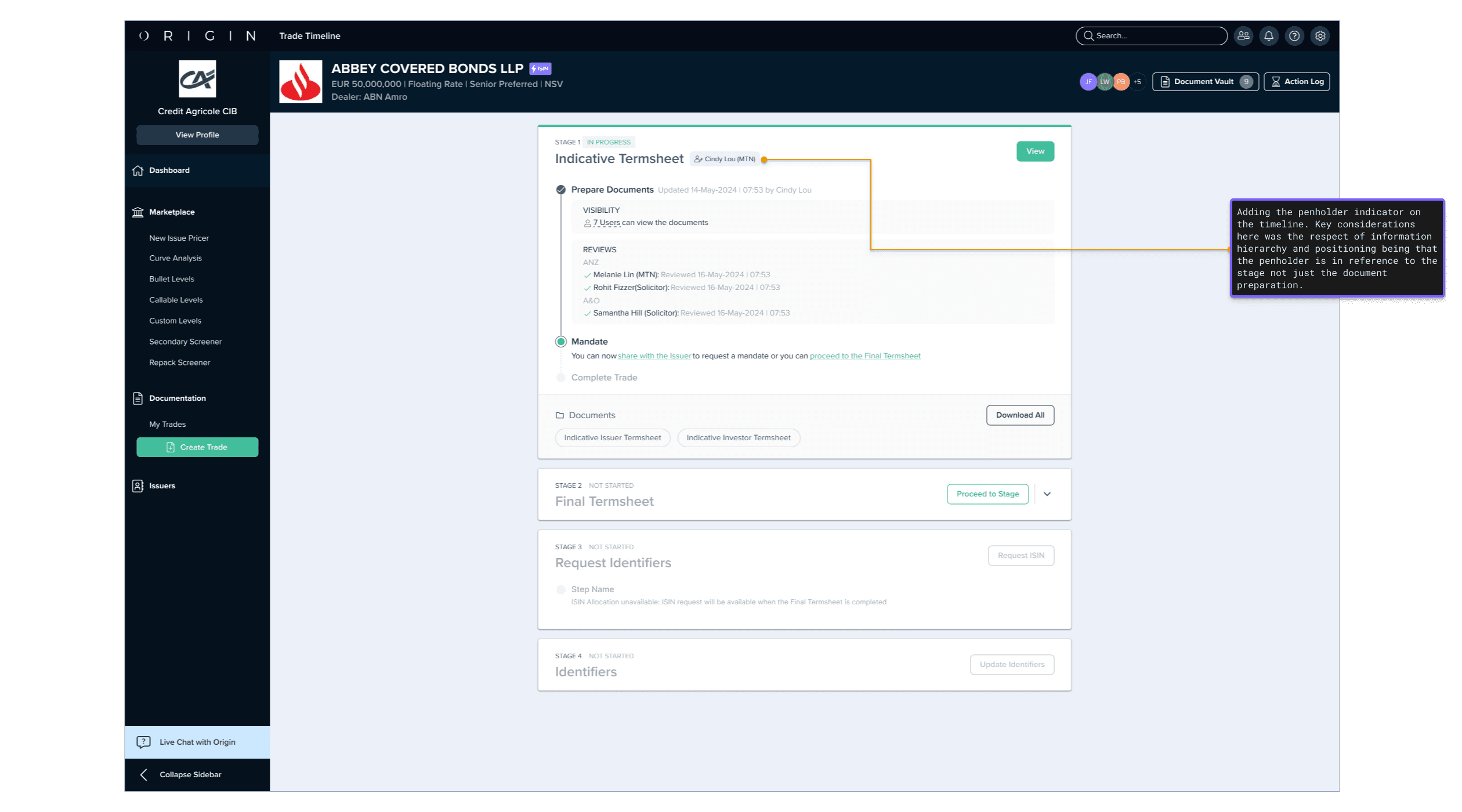
The penholder concept was understood. The consequences weren’t visible.
Users actually use the term penholder. It’s industry language. When we tested alternatives like “lead editor” there was pushback. The confusion came from what happened when you took the pen: unsaved changes from the current penholder could be lost with no warning. The feature was also only available post-trade, when users needed it from the start.
The review workflow assumed a linearity that doesn’t exist.
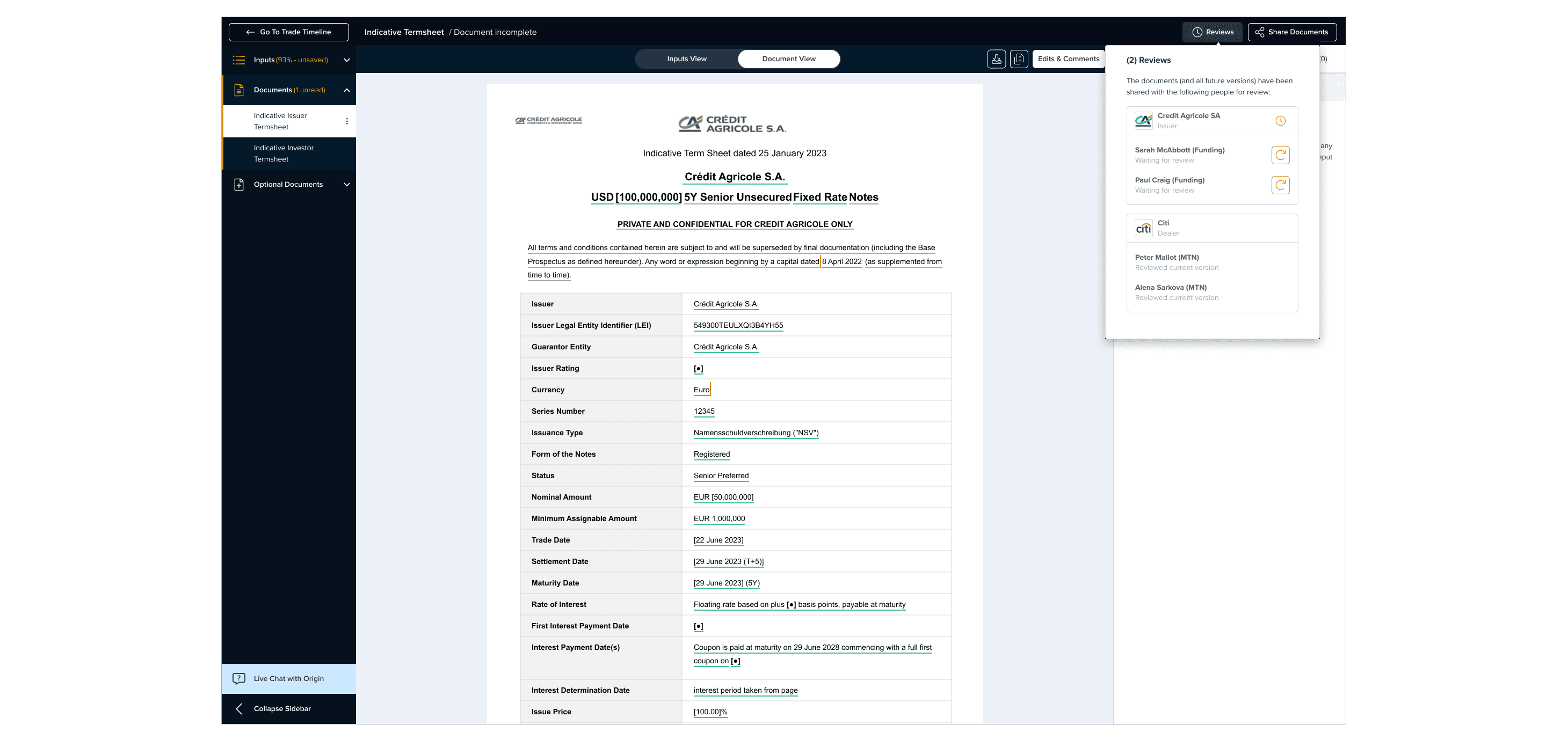
The platform enforced a fixed sequence: internal preparation, review, share with issuer, mandate. Legal teams work in rounds, go back and forth, and need to request the same reviewer more than once. Pending reviews appeared to block trade progression even when they didn’t, so teams would move forward unsure whether they were supposed to. Comments posted in real time, so reviewers would send partial feedback mid-review, editors would resolve it and mark it done, and the reviewer would have no record it ever happened.
Fifty emails per trade trained users to ignore all of them.
The notification system was built to satisfy early clients with strict security requirements, one email for every action. The result was around 50 emails per trade and a sub-10% open rate by the early stages of a trade. When an email actually required action, it got missed alongside everything else.
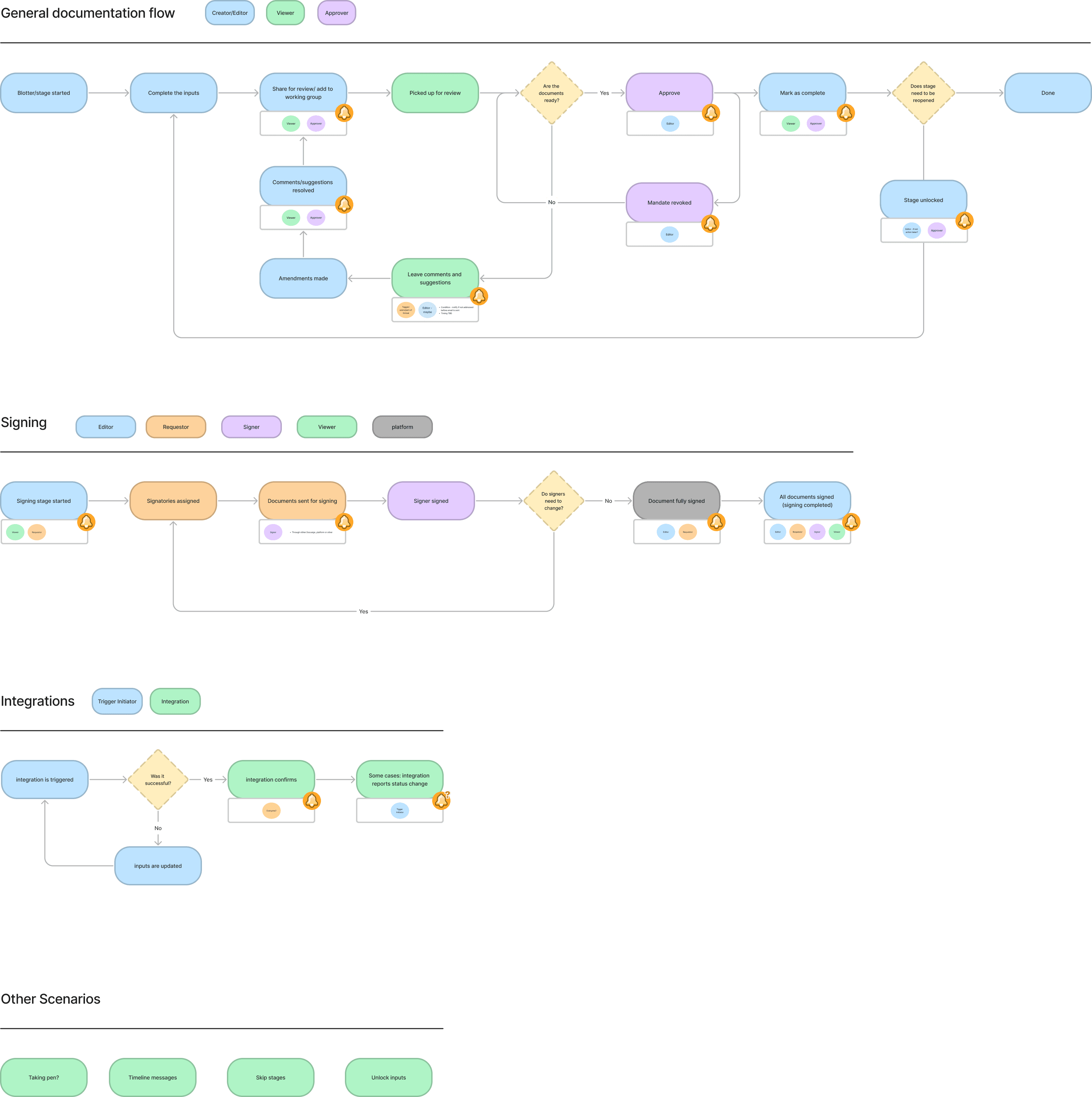
Fixing the penholder - Clarity over redesign
I didn’t rebuild the single-editor model. Rebuilding the document generator for real-time collaboration wasn’t viable, and users didn’t need it. They were comfortable with one editor at a time. What they needed was to understand the rules and trust the system.
Two changes did the work. First, make the current penholder visible to everyone at all times, on both the timeline and document views. Second, add an explicit warning when taking the pen would discard someone else’s unsaved changes. Destructive actions need friction and the original design wasn’t adding enough of it.
We also extended pen-swapping to the term sheet stages, where users had previously been locked out of it entirely. The feature worked the same way as before. Users could finally reason about it.
Timeline page before/after

Document page before/after

Fixing reviews - The workflow isn’t linear
The review redesign was less about adding features and more about dismantling assumptions baked into the original build.
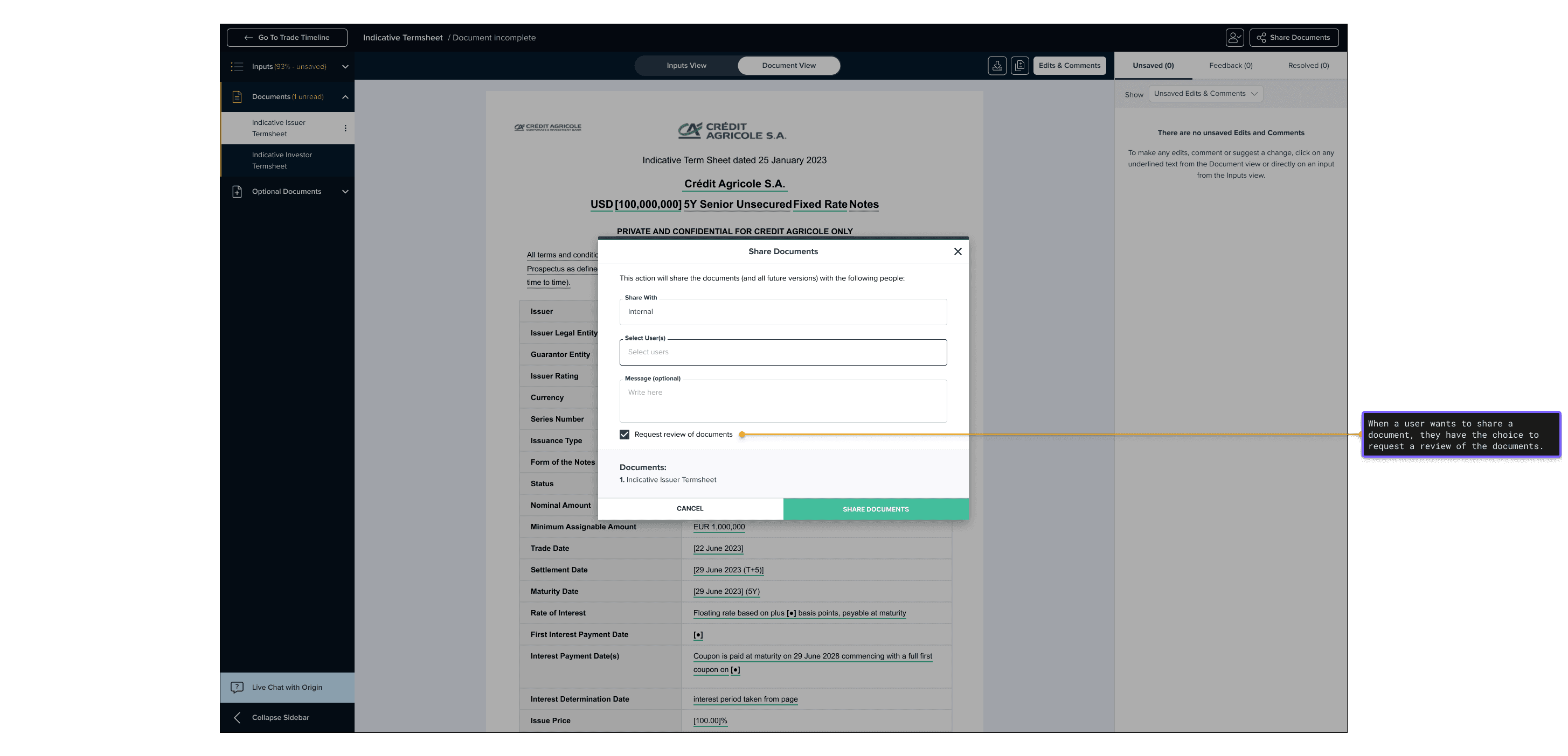
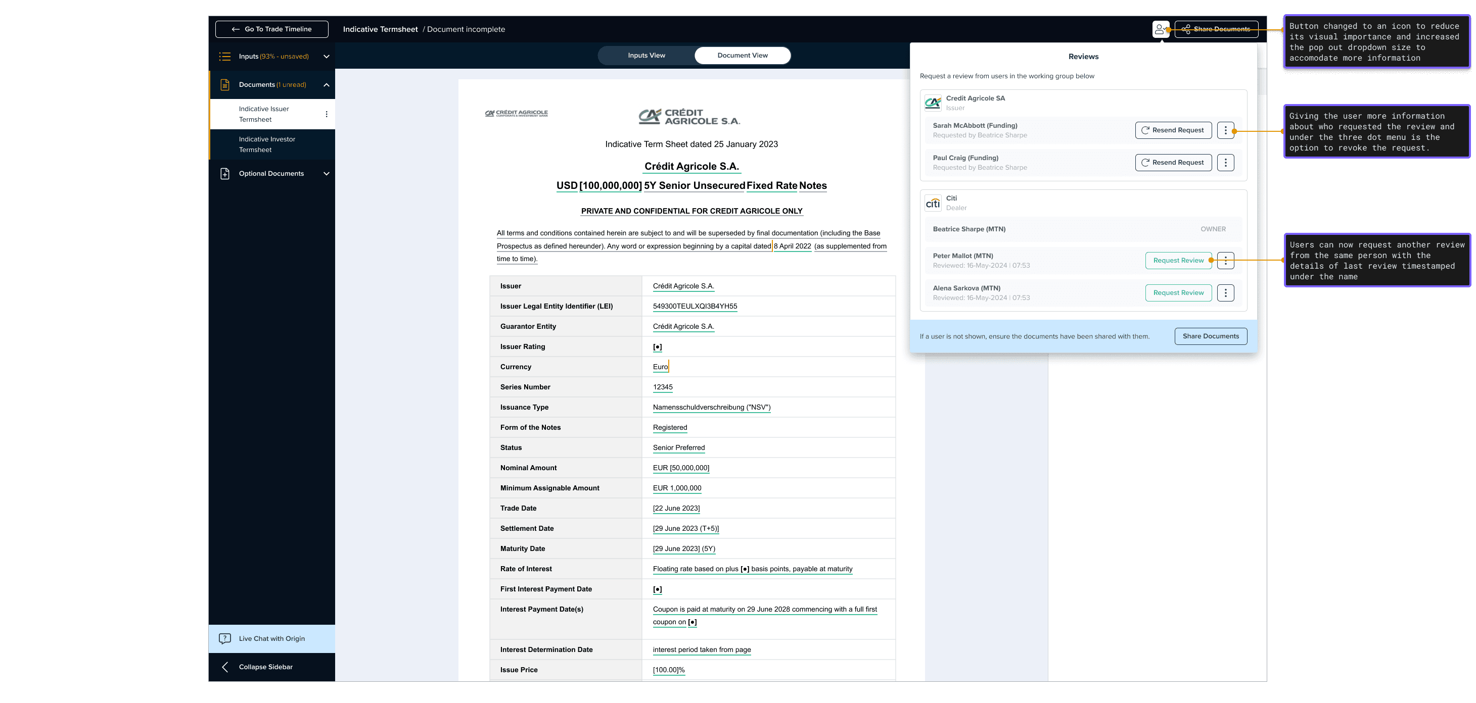
Reviews can now be requested at any time, to the same person more than once. Adding someone to the working group and requesting a review are separate actions. Previously they were bundled, meaning you couldn’t do one without the other. Pending reviews no longer appear to block trade progression.
Comments are now drafted and submitted together rather than posted in real time. That change mattered most. Legal reviewers want to write everything, review it, and submit it as a complete picture. Real-time commenting made sense as a feature in isolation. In context, it created confusion about what had been seen, what had been resolved, and whether a review was actually finished.
Share modal before/after

Reviews panel before/after
Commenting before/after


Email content before/after


Fixing notifications -
Start from a methodology
Patching the existing system wasn’t the right call. The problem was that there was no principled logic for when an email should be sent or what it should contain. I started from scratch with two questions: when does a user need to be contacted, and what do they need to know?

That mapping revealed something useful: Job titles don’t predict notification needs!
A dealer on one trade might be a passive observer on another. So instead of notifying by role, we created three fluid categories based on how a user is actually engaging with a trade:
Creators and Editors — primary action-takers who don’t need confirmation of their own actions.
Approvers — contacted only when their input is required to move forward.
Viewers — updated at key trade milestones, not every step in between.
Once mapped out this simplified the view of notification events on the key workflows.
To support more targeted in-platform communication, we replaced the generic internal comment type with private commenting, directing comments to specific users rather than broadcasting to the working group. @mentions gave an additional layer of precision.

We also improved the emails themselves. Action-required notifications now surface the most important comments directly in the email body, so users can assess urgency without logging in. For clients with security and audit requirements, we introduced a daily digest as an alternative to per-action emails.

Impact
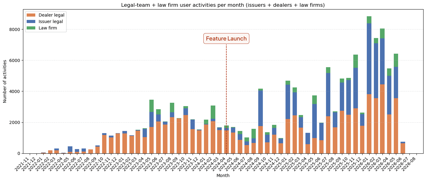
136% more legal user activity in 1 year
Total legal user actions on the platform more than doubled in the 12 months following launch, rising from ~29,000 to ~69,000 per year. A signal that the redesign was removing friction at the points it had been targeting.
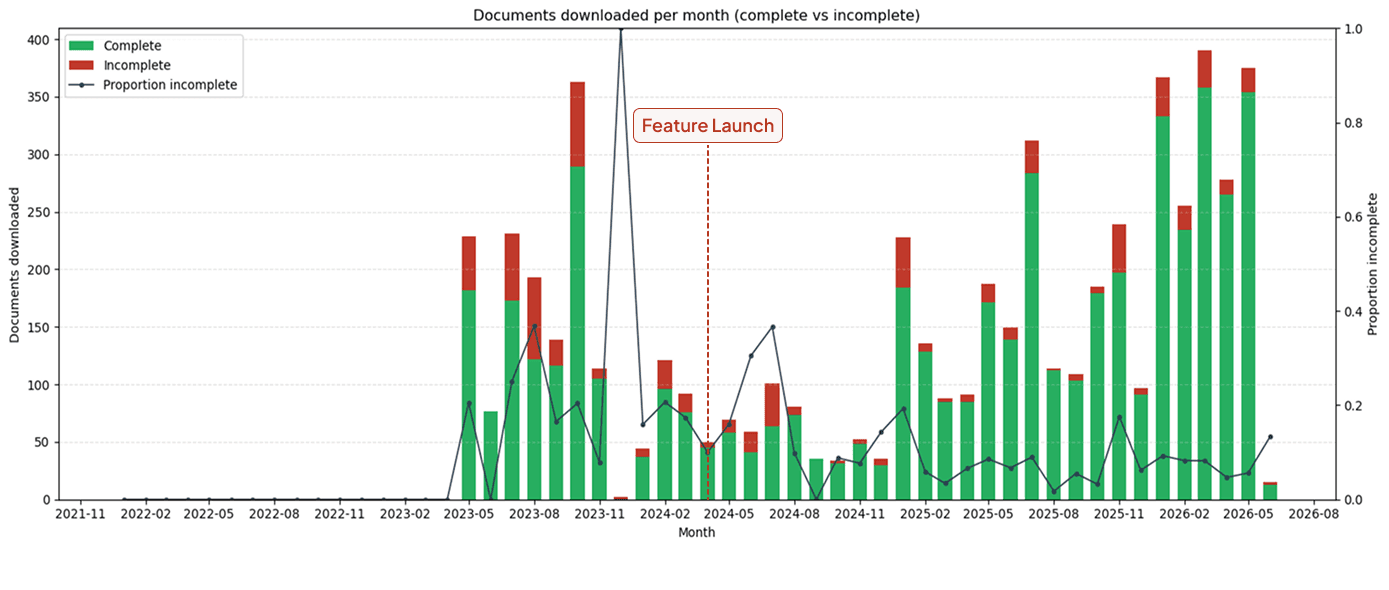
Incomplete doc downloads drop 59%
The proportion of document downloads that were incomplete fell from over 20% pre-launch to under 9% post-launch. Users were finally completing documents on the platform rather than pulling drafts to finish in Word.
80% fewer emails for editors and approvers
Editors and approvers now receive fewer than 10 emails per trade, down from around 50, with viewers receiving fewer than 5. Notifications now mean something rather than getting ignored alongside everything else.
90% fewer emails for viewers
Viewers now receive fewer than 5 emails per trade. Passive oversight users get updated at key milestones instead of every action in between.
~9x email open rate
Email open rates rose from 8.4% to 74% post-launch. Users are reading what they receive because they're only receiving what they need.
Post-launch feedback has been largely positive. Some users want more frequent updates, which we’re treating as a V2 personalisation problem. Giving users control over their own notification frequency is a better answer than designing one system that tries to satisfy everyone.
What I learned
The instinct on a project like this is to look for missing features. Users aren’t happy, so what can we add? Every problem here came from assumptions embedded in the original design. The penholder existed. Reviews existed. Notifications existed. They just all assumed a version of the user’s workflow that didn’t match reality.
The harder design skill is knowing when the problem is what the system has silently decided about how people work.