Lebara CRO (Conversion Rate Optimisation)
75% of Lebara's customers were buying on mobile. The purchase flow wasn't built for it.
ROLE
Research and UX Manager
CLIENT
TPG Telecom

Detailed view
TL:DR
Background
Following the native app project, I led a separate workstream focused on the Lebara website purchase journey. The brief was to understand where customers were dropping off during plan purchase and use that to drive measurable improvements to conversion rate. I owned the research end to end: methodology, analysis, synthesis, and design recommendations.
How I approached it
Rather than auditing the whole site, I scoped the research to a single goal-oriented flow: a brand new customer purchasing a 30-day plan. That's the highest volume purchase journey on the site and the one with the most to gain from improvement.
Three data sources gave me the full picture.
Google Analytics provided quantitative behaviour data and device demographics.
Heatmap data showed exactly where users were clicking, scrolling, and dropping off across both desktop and mobile.
Online reviews across every major platform were collected, sorted, and clustered by theme to surface qualitative pain points that the quantitative data couldn't explain on its own.
What the data showed
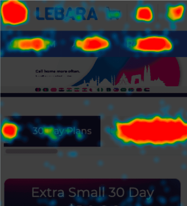
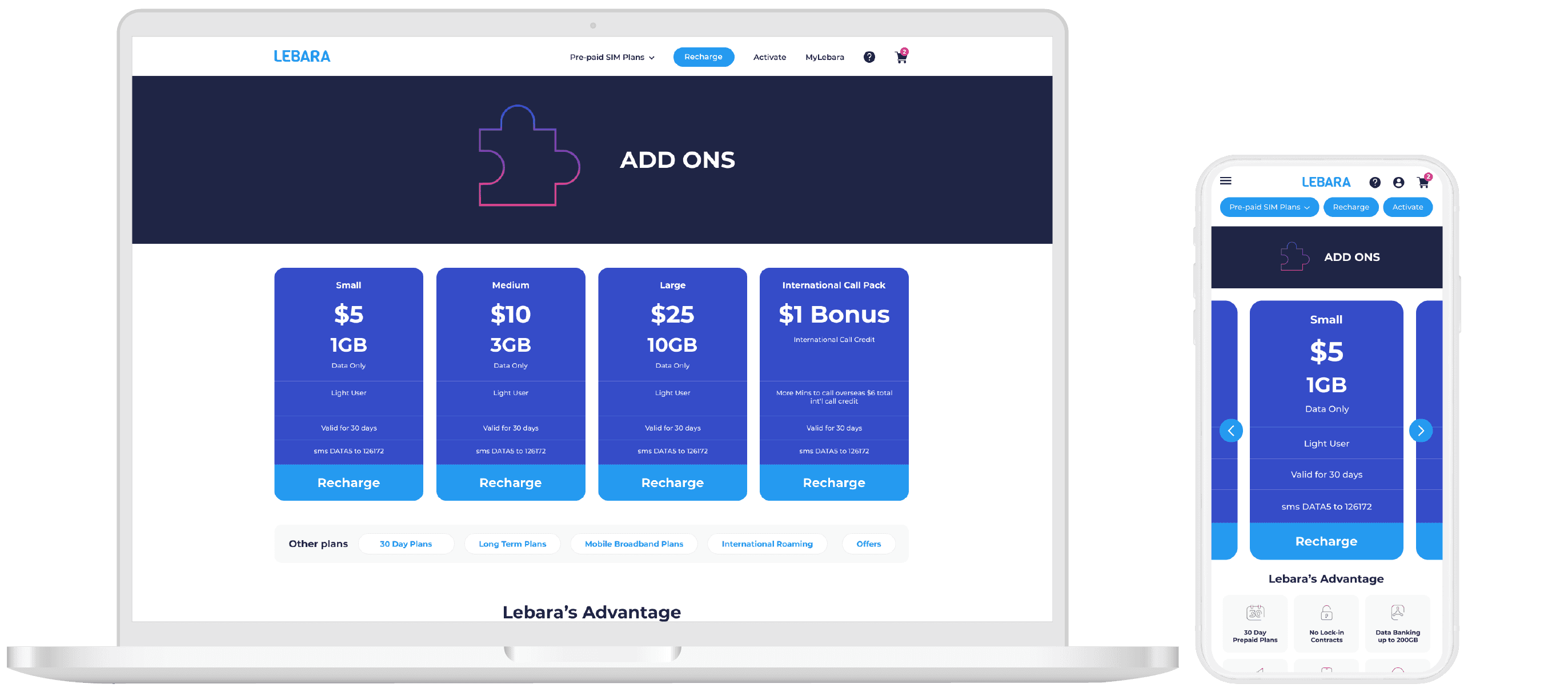
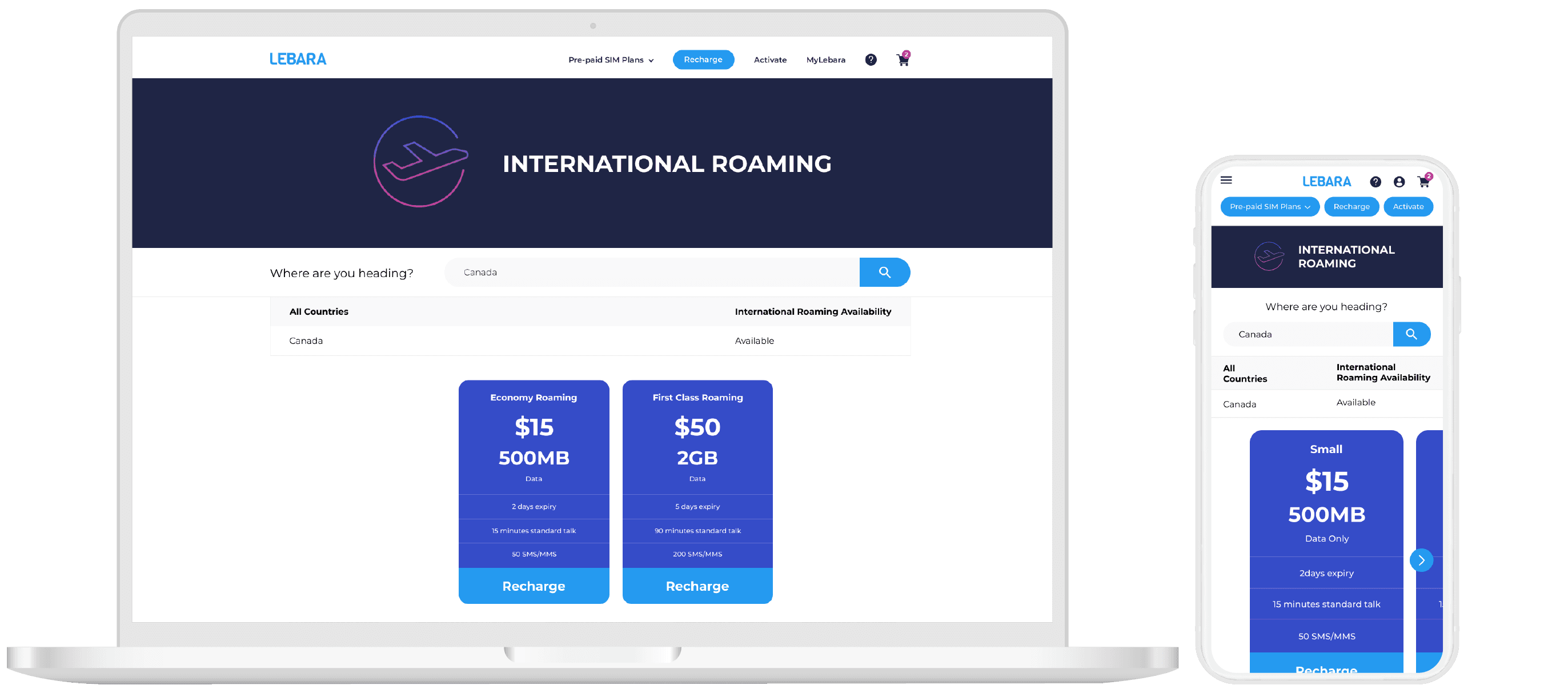
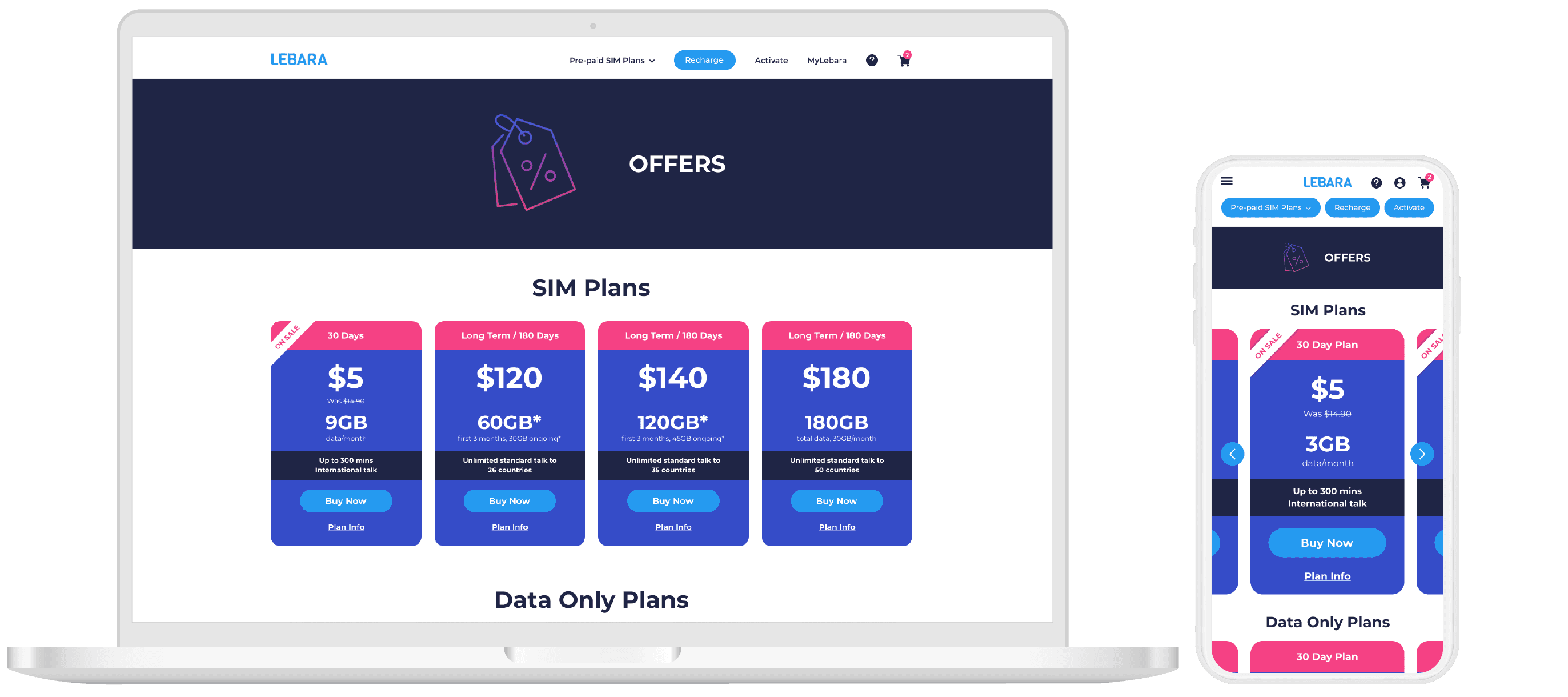
Customers on the 30-day plan page were looking at other plans before converting.
Google Analytics confirmed that users who eventually converted on the 30-day plan had almost all visited other plan pages first. The heatmap made the reason clear: the most clicked element on the 30-day plan page, on both desktop and mobile, was the "Long Term Plans" navigation button. On desktop it captured 24.6% of all clicks. On mobile, 16.9%.

Desktop
Mobile
The page was designed to sell one plan type. Users were using it to comparison shop across the whole range, then coming back. The navigation was working against the conversion goal.
Most users were on mobile, and mobile was converting worse
75% of users visited the site on mobile. 74% of conversions came from mobile. But the completion rate told a different story: 18% on desktop versus 11% on mobile. Mobile was carrying the majority of the traffic and losing more of it at checkout.
18%
completion rate for desktop
11%
completion rate for mobile
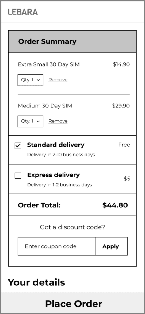
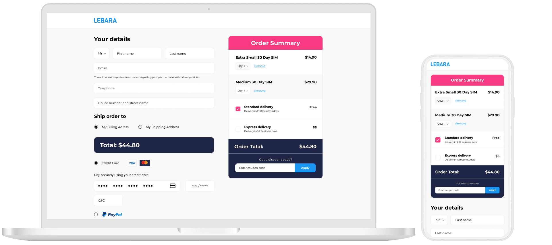
The mobile checkout was adding items to the cart that customers hadn't chosen.
This was the sharpest finding. On desktop, the most clicked button on the checkout page was "Order Now" at 11%. The second most clicked was "Edit Order" at 9%. On mobile, those positions flipped: "Edit Order" was the most clicked at 13%, with "Place Order" second at 11.6%.

Desktop

Mobile
The pattern across both devices pointed to one thing: customers were regularly seeing two items in a cart that should have contained one. The mobile checkout was duplicating the order, and customers were having to edit it before they could complete the purchase. An extra, unexpected step immediately before payment is one of the highest-friction points possible in a purchase flow.
Two problems, two solutions.
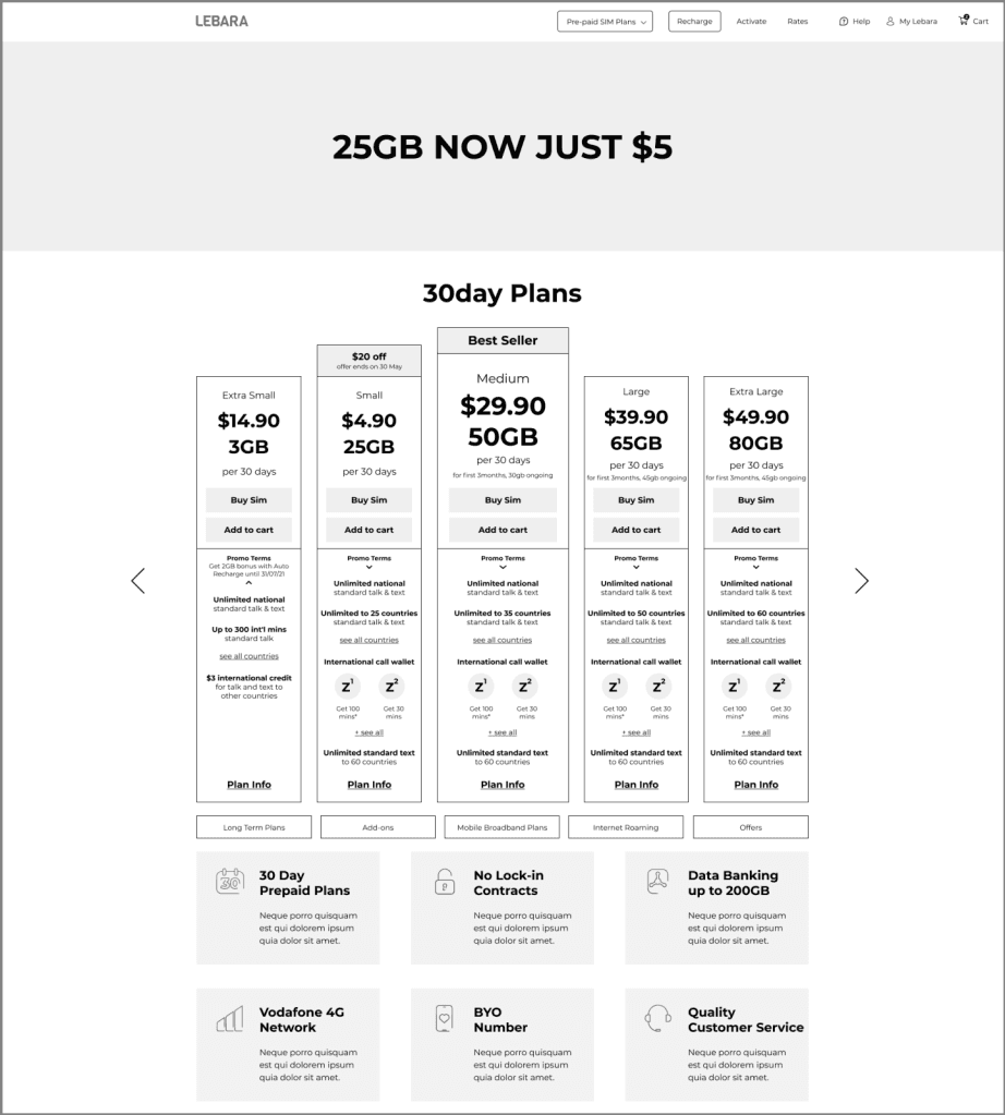
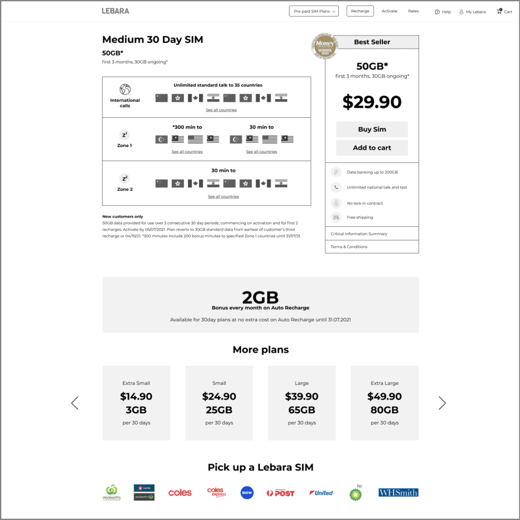
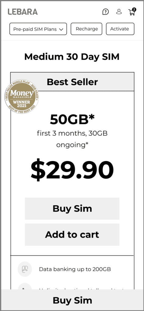
30-day plan page: reduce the noise, clear the path
The page was presenting too many options to a customer who had already decided what they wanted. The recharge button visible on the plan page made sense for existing customers but created confusion for new ones who hadn't activated yet. I removed it from the page body and surfaced it in the top navigation instead, where existing customers would find it without it distracting new ones.
The sub-menu sitting beneath the page banner was the entry point for the plan-hopping behaviour the heatmap showed. Moving it below the plan carousel rather than above it meant customers saw the plan they came for first, with the option to explore other plan types available but not competing for attention at the top of the page.
Within the plan cards themselves, colour was stripped back to keep focus on the three things that drive a purchase decision: price, data allowance, and the buy button. The plan info button, previously small and easy to miss, was made larger and more visible for customers who needed more detail before committing.

Wireframes


Before/After
Other plan screens

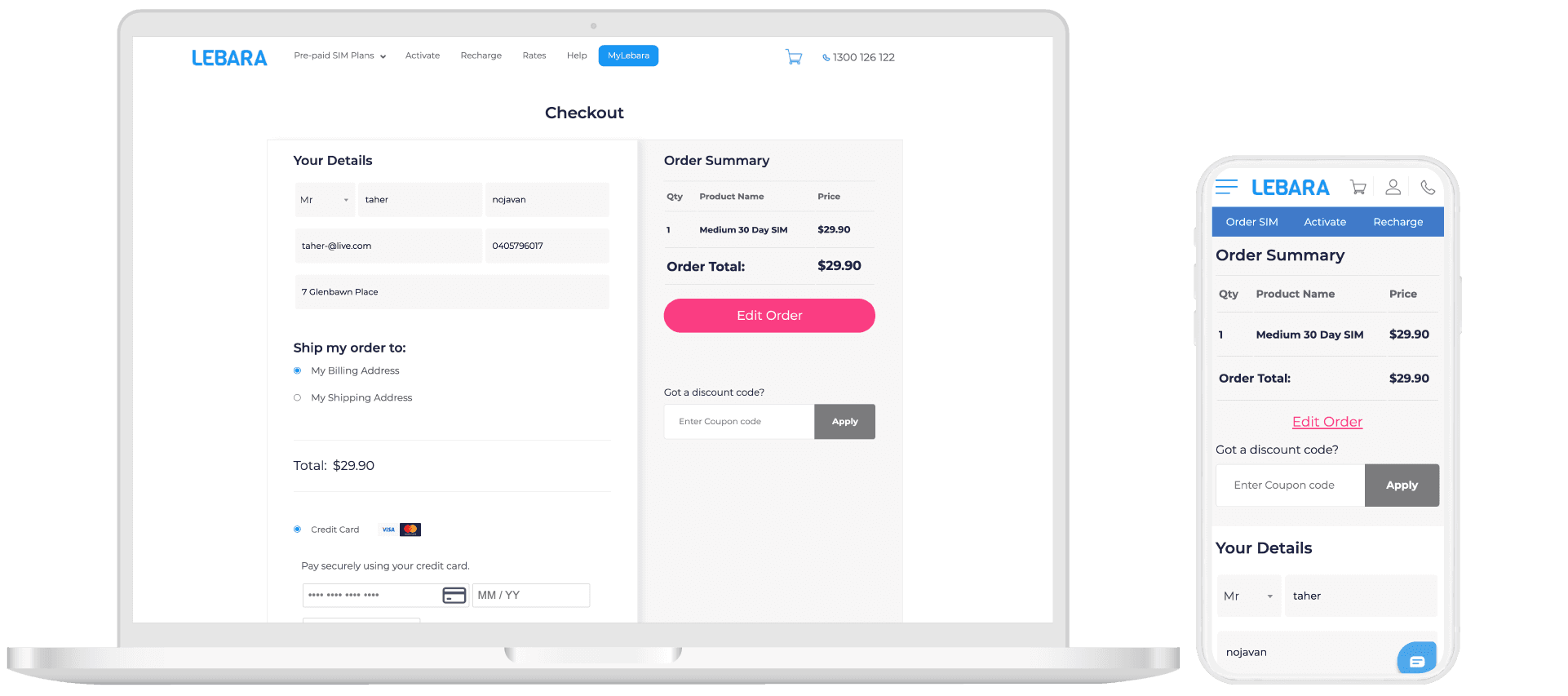
Checkout page: fix the cart, mobile first
The core fix was making the cart fully editable inline on mobile, rather than requiring customers to navigate to a separate page to adjust quantity. The duplication issue created an avoidable trust problem at exactly the moment a customer needs to feel confident about what they're buying.
Shipping cost and total were made clear earlier in the flow. An express post option with a dynamic delivery estimate was added, giving customers accurate information rather than a generic timeframe.

Wireframes
Before/After
Next steps
The designs were handed over for implementation with a clear brief for follow-up: run usability testing on the updated flows to validate the changes before full rollout, then track conversion rate on mobile checkout as the primary success metric post-launch. I unfortunately left the company shortly after this project and wasn't able to get metrics for the success of the redesign.
What I learned
Quantitative data rarely tells you what's wrong directly. It tells you where to look.The cart duplication bug was the most instructive finding on this project. It showed up in the heatmap data as a behavioural pattern before anyone had reported it as a bug. The "Edit Order" button being clicked more than "Place Order" looked like a UX preference at first glance. It was actually customers correcting an error the system was making.