My Lebara App
Redefining the Lebara App experience
ROLE
UX/UI Designer
CLIENT
TPG TELECOM

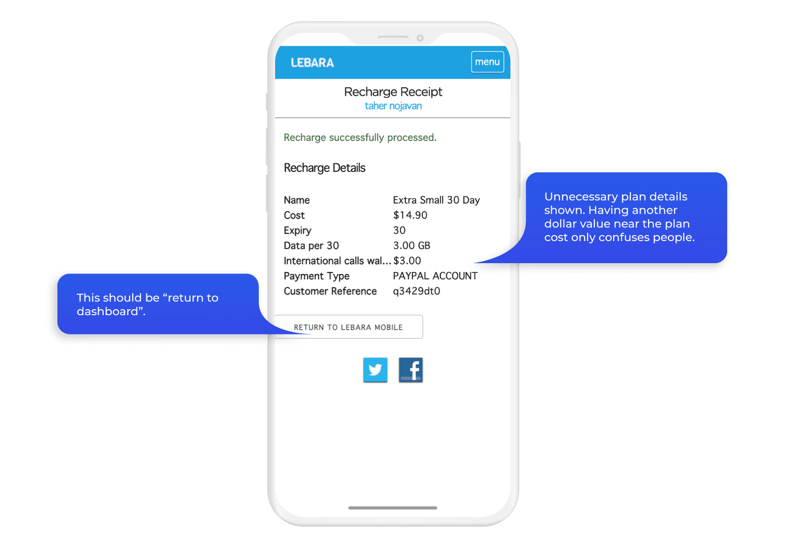
Detailed view
TL:DR
Background
Lebara is a prepaid mobile provider and subsidiary of TPG Telecom, operating in Australia since 2008. Its customer base skews toward people who want straightforward, low-cost mobile plans without a contract. The existing “app” was a mobile render of the website, not a native product. It behaved like a browser pointing at the same flows customers used on desktop, with no concessions made for mobile context, speed, or the specific tasks prepaid users actually do on their phones.
TPG Telecom engaged me to design a native iOS and Android app from scratch, covering both customer onboarding and ongoing account management.
What I was trying to solve
Prepaid mobile is a high-churn category. Customers leave when recharging feels like effort, when they can't quickly see what they have left, or when activating a new SIM takes long enough that they question whether it's worth it. The existing flow had friction at every one of those points.
Three things needed to work well for the app to succeed.
Activation had to be fast enough that a new customer could get on the network in under three minutes.
Recharging had to be quick enough that customers did it in the app rather than going elsewhere.
The account overview had to give customers an immediate read on the three things they actually care about: how much data they have left, when their plan expires, and what's in their Data Bank.
Mapping the existing flow
Before designing anything, I mapped the full activation and account management journeys to identify where the current experience was losing people.

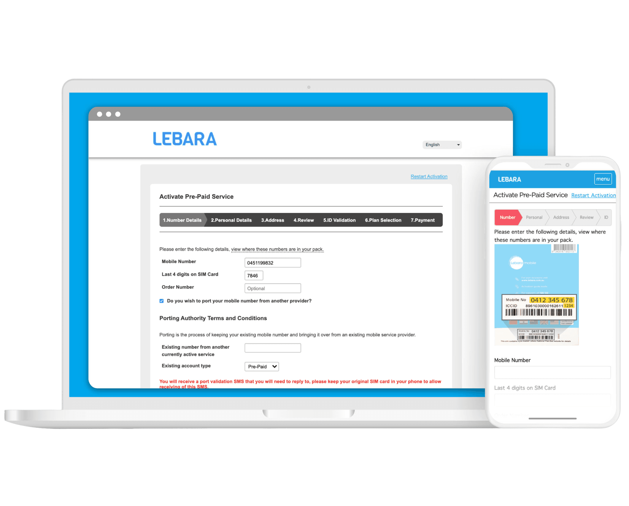
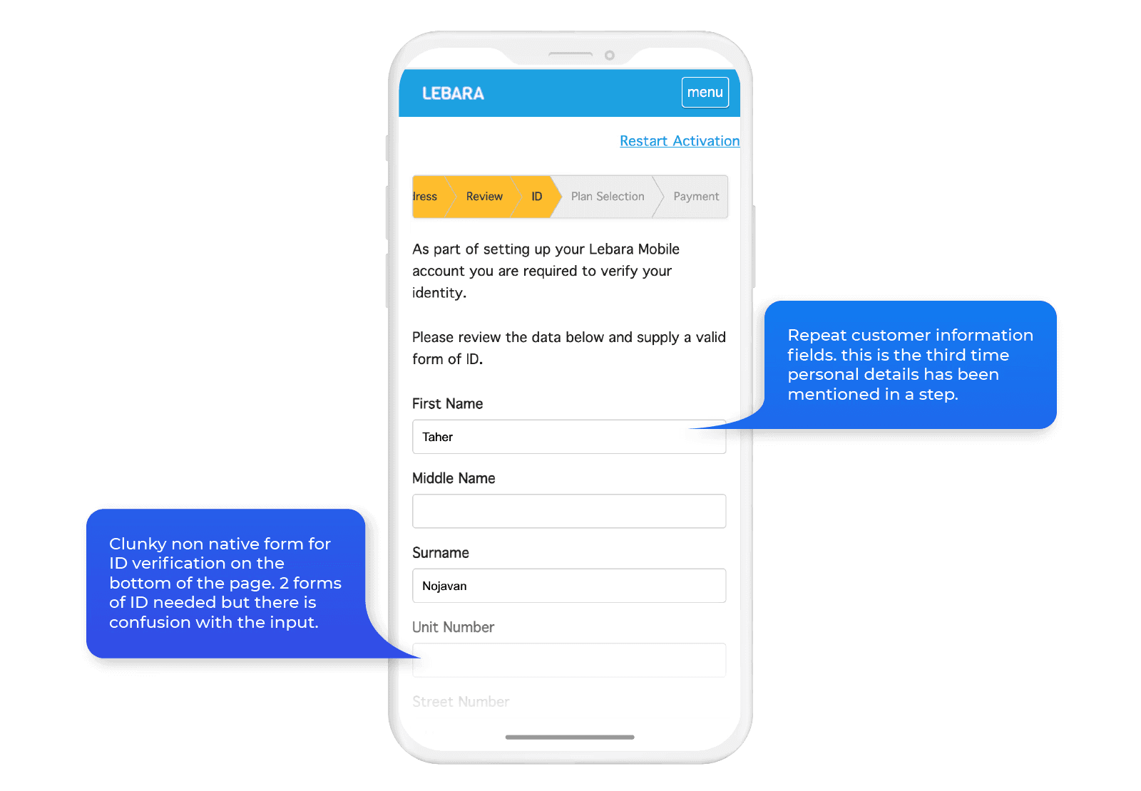
The activation flow had seven steps: SIM number details and port-in, personal details, address, review, ID validation, plan selection, and payment. Each step was a separate screen. ID validation sat in the middle of the flow, disconnected from payment, adding a step that created confusion without adding clarity.

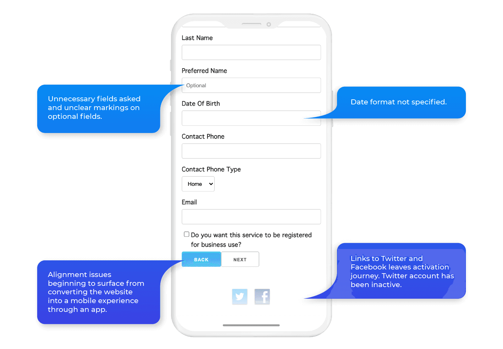
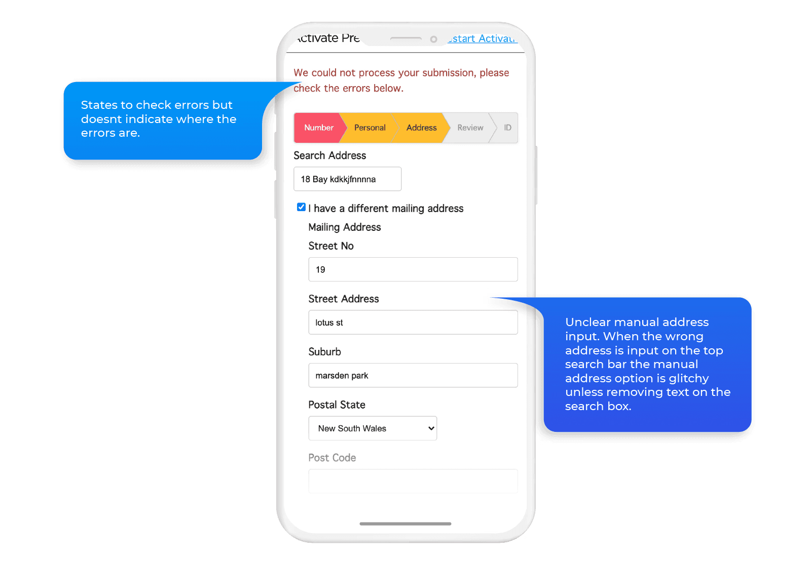
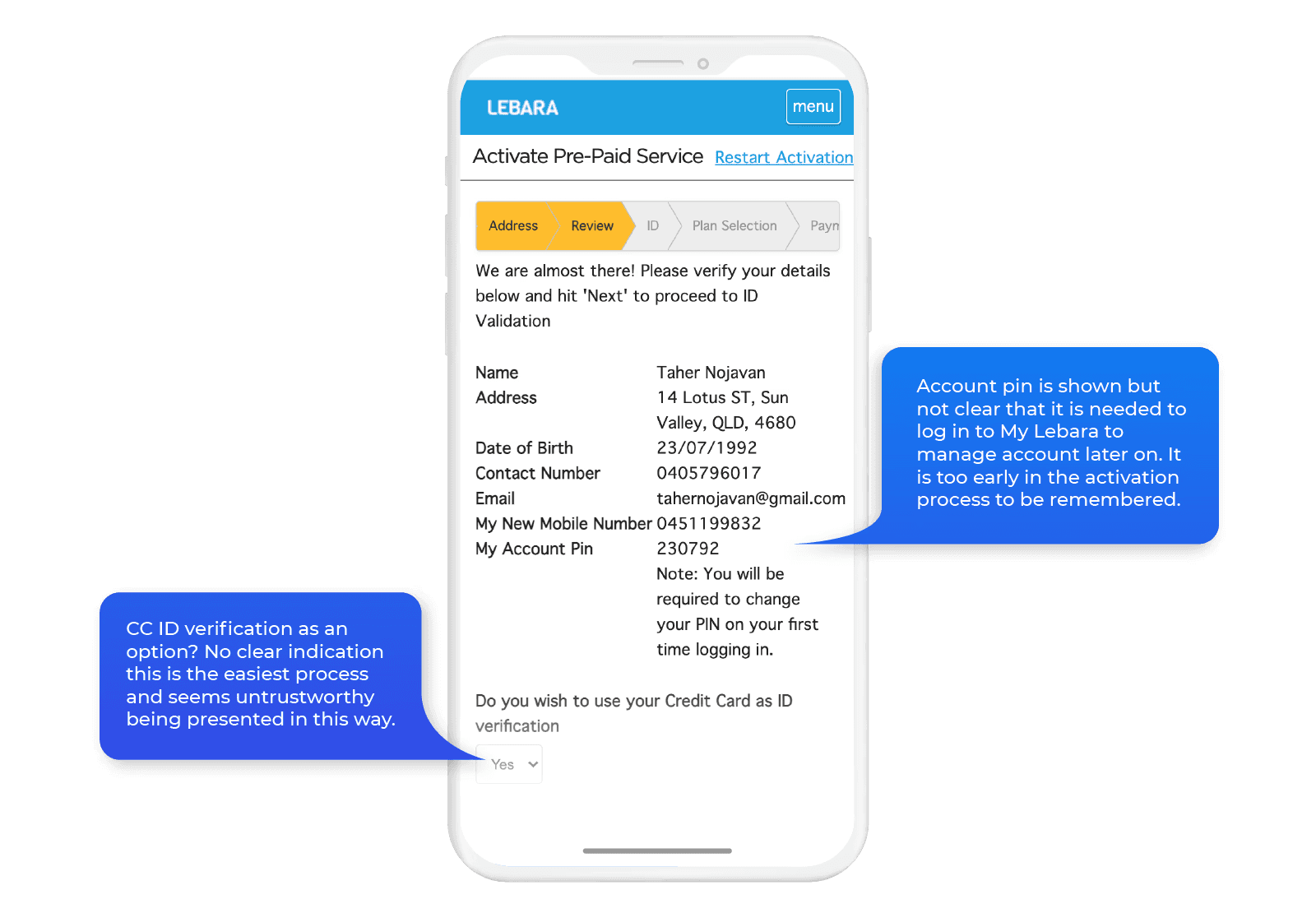


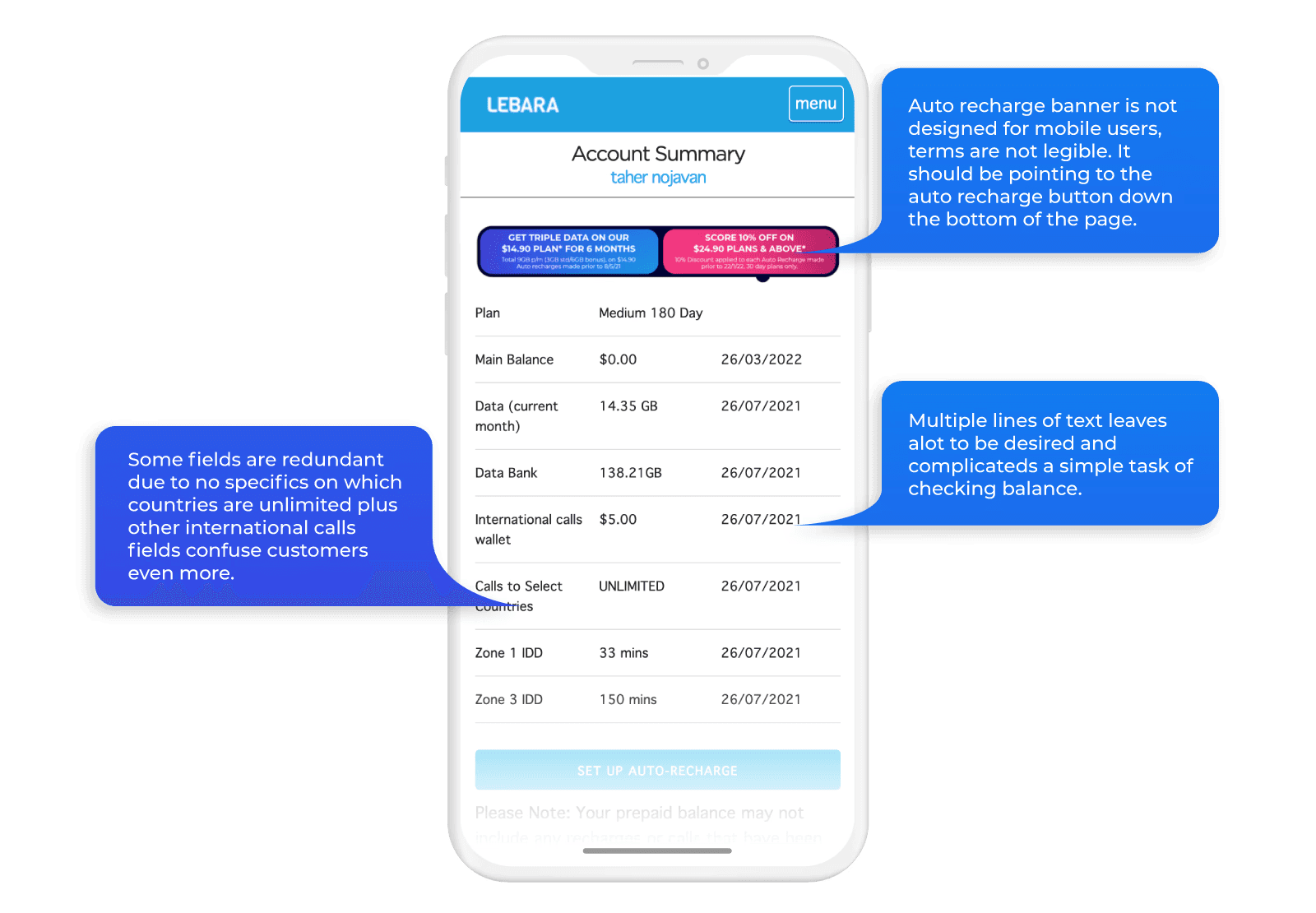
The account management flow had its own problems. Plan information was spread across screens rather than surfaced together, add-ons were buried, and the three core pillars customers cared about, data usage, expiry, and Data Bank balance, had no visual treatment that made them scannable at a glance.


I split each step across the existing flows into three categories: service requirements (what the system needs), customer requirements (what the customer needs to provide), and legal requirements (what’s mandated). That audit identified which steps were doing real work and which were redundant.
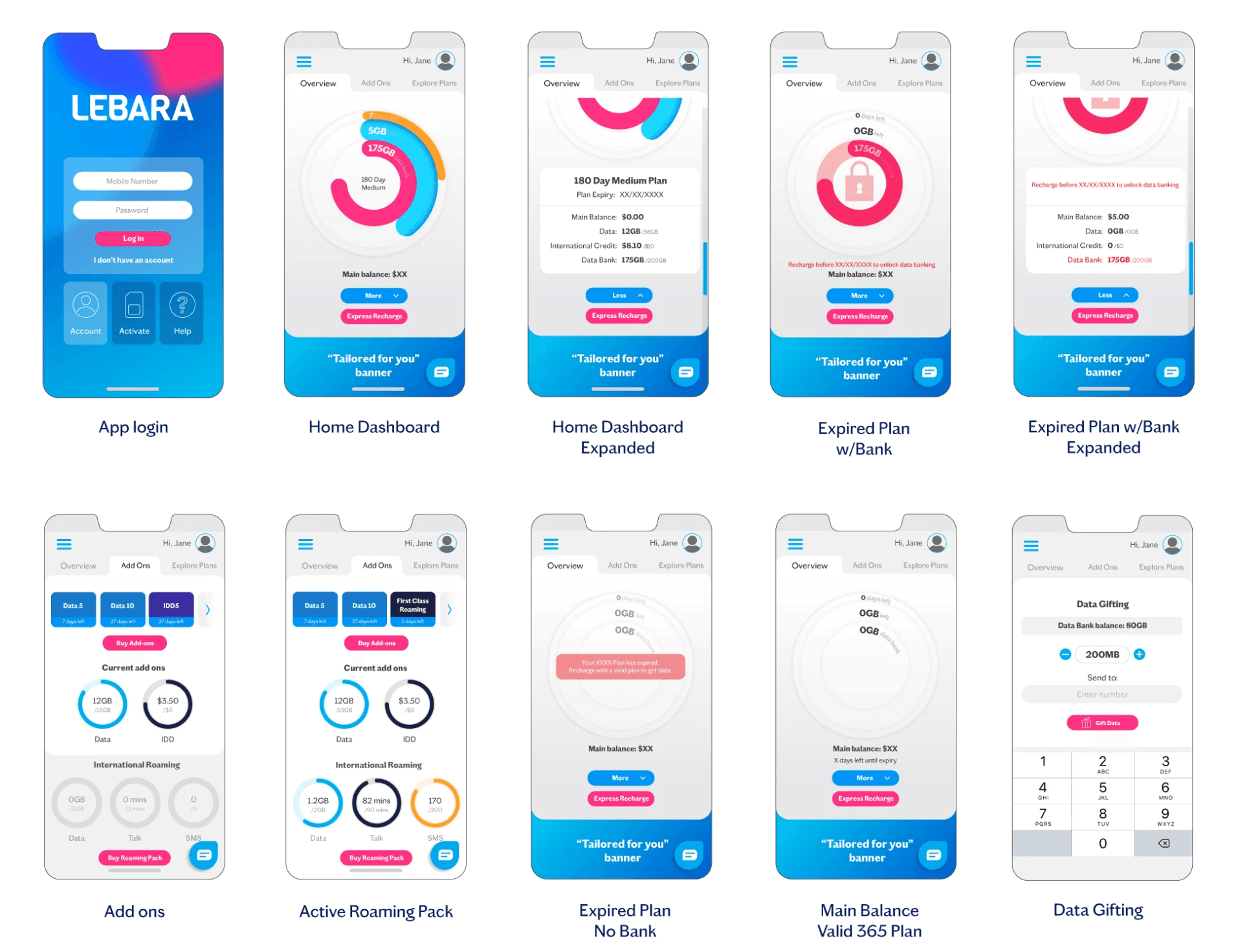
Initial mock ups


Final Outcome
Activation: from seven steps to six, with time savings at each one
Old activation flow:
SIM number details + Port in > Personal details > Address > Review > ID Validation > Plan Selection > Payment
New activation flow:
Scan sim > personal details > Address > Choose existing number or port in > Choose plan > Payment
Scanning the SIM replaces manually entering a 12-digit ICCID number. The same scanning mechanic handles credit card input. ID verification was consolidated into the payment step rather than treated as a separate gate. Plan confirmation, previously a standalone screen, was removed.
A customer can now activate in under three minutes


Recharge: fewer taps isn’t always the right goal
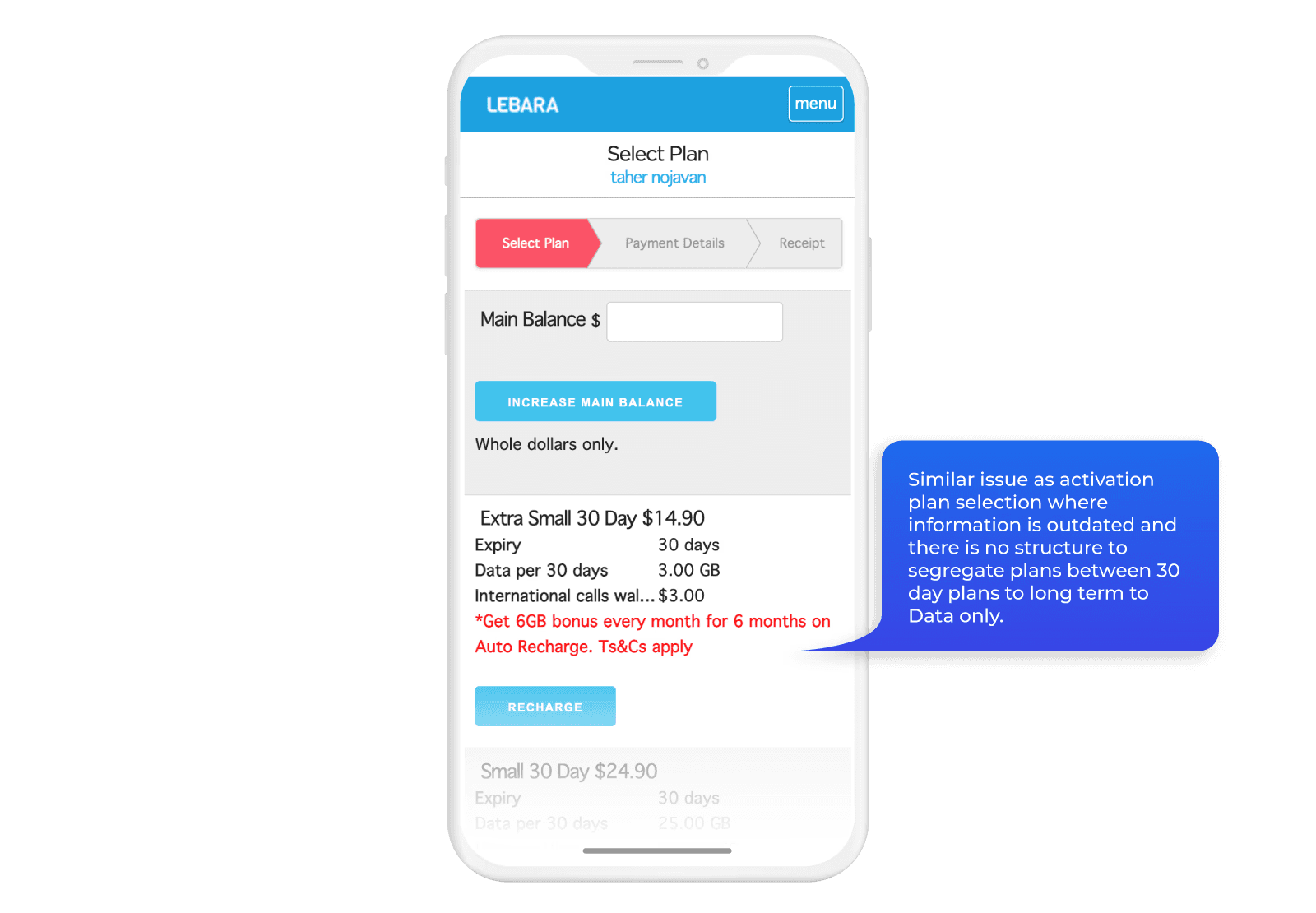
Old activation flow:
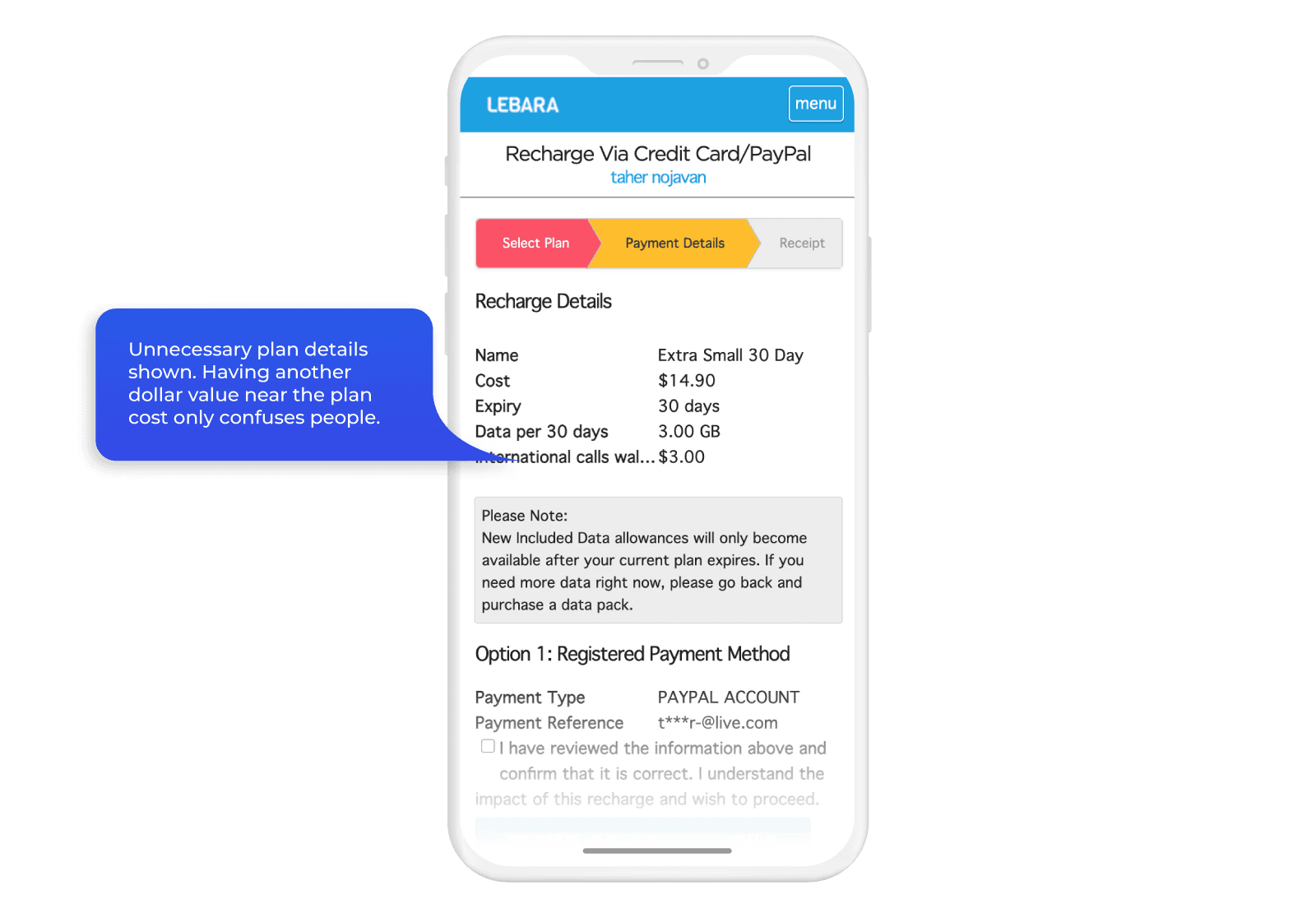
Recharge > Payment method > Select plan > Confirm recharge > Input payment details
New activation flow:
Recharge > Select product family > Select product validity type > Select product > Payment options > Input or confirm payment details > Confirm recharge
The old recharge flow had five steps. The new one has seven. That sounds like a regression and it isn’t.
The extra steps come from grouping plans into product families before asking customers to choose. In the old flow, customers landed on a flat list of every available plan. The time lost navigating that list was far greater than the time saved by having fewer screens. Grouping by family first reduces decision load at the point that matters.
For customers who just want to renew what they already have, Express Recharge cuts the flow to four taps: Express Recharge, payment options, confirm payment details, confirm recharge. Plan selection is skipped entirely.
A user can recharge in 4 taps with much less cognitive load
Account overview: three things visible in one glance
The MyLebara dashboard was designed around the three plan pillars customers check most: data allowance, plan expiry, and Data Bank balance. All three are represented as donut charts on the overview screen, so a customer can log in and read their plan status without navigating anywhere.
Add-ons sit in a separate tab covering data and credit additions alongside roaming product details. Every feature previously available via the mobile website is available in the app.


Design and animation
The visual design uses Lebara’s brand colours to create clear interactive zones against a white background. The goal was a minimal aesthetic where the plan data is the thing that draws the eye, not the UI around it.
Animation is used sparingly. Transitions are subtle and smooth, intended to make the experience feel fluid without drawing attention to itself.
Also created this animated video below for the launch.
How it landed
App Store
4.2/5
The majority of positive reviews mention the interface and ease of use directly.
“Hats off to Lebara for creating the most simplistic and user friendly app I have seen in a long time. The usage meter and express recharge makes a the whole experience for prepaid mobile stress free.”
BriefcaseMon
★★★★★
Negative reviews vary from service issues (non app related) and with case by case glitches on the ID verification option for non credit card users.
“Works smoothly till you get to the ID. Though it gives you many ID options, Medicare, drivers license, etc NONE work, it will only allow you to register with a credit card nothing else.”
Mr Spockstar
★☆☆☆☆
Google Play
3.6/5
Positive reviews focus on design and features.
“Looks and feels fantastic. I love this simple amazing app.”
Ada
★★★★★
Negative reviews split between ID verification bugs and Android-specific issues, both expected given the breadth of Android device types in the market.
“Annoying theme. You don’t have basic copy/paste editing. Worst app.”
Johnny W
★☆☆☆☆
Update: this feature has been updated to include copying and pasting numbers on login.
What comes next
Four things are on the roadmap based on post-launch feedback.
Family plan support is the most requested missing feature. Managing multiple services under one account is something a meaningful portion of the user base wants and the app doesn’t currently support.
SIM swap needs to come into the app. It’s the one feature still requiring customers to go elsewhere and it creates friction at exactly the moment a customer is most stressed about their service.
Android optimisation is ongoing. ID verification bugs affect a subset of Android users and need resolving before the rating on Google Play reflects the actual experience.
The plan overview screen needs a clearer breakdown of data per cycle versus total plan data. Some customers are confusing the two and that’s a design problem, not a user error.
What I learned
This was the first project where I had to design around legal and regulatory requirements as hard constraints rather than considerations. The activation flow audit forced a more rigorous way of thinking about each step: not “does this feel like too many screens” but “what category of requirement does this step actually serve, and is it doing that job in the right place.” That framing is something I’ve carried into every onboarding problem since.
The recharge flow also taught me something about how to talk about design decisions. Seven steps versus five looks like the wrong direction until you understand what changed at the step that mattered. Learning to lead with the outcome rather than defend the number is a communication skill as much as a design one.