Role
Research/UX Manager
Overview
This report will analyse the user experience and journey while on the purchase journey for a 30 day plan. This report aims to understand our users and find the pain points of our users. In order to design a solution for our user to improve their experience and essentially, increase the conversion rate.
Objectives
Using this report, revise and optimise the current website front end to address customer pain points and increase conversion rate.
Methodology
Google Analytics
We used Google Analytics for quantitative data analysis and to understand how users interact with the website. Demographics for our users were also collected using this method.
Heatmap Data
We used heatmapping data to understand the user path flow and how users are navigating between pages.
Online Reviews
We collected, analysed and sorted all the online reviews on the internet to understand common themes and problems that users are facing. This type of qualitative data helped us understand our users feedback from their experience with Lebara.
Each customer will have a different user flow and experience, and it will be valuable to look at each goal-oriented flow separately. For this research, we have chosen to look specifically at the Brand New Customer who is looking to purchase one of the 30 day plans.
Goal Oriented Personas
Brand New Customer
Existing Customer
first time activating
Existing Customer Wanting to top-up
Existing Customer
with an issue
Character Personas

27 year old male
Ethnicity: Pakistani
Device: Mobile
He lives in Sydney. He is family oriented and regularly needs to call overseas to speak to his family in Pakistan. He uses his phone for everything such as look up for jobs, stream movies, browse and dealing with his banking.

39 year old male
Ethnicity: Indian
Device: Mobile
He lives in Melbourne and he regularly needs to call overseas to speak to his family in India. He is interested in looking up jobs and real estate. He is tech savvy and is interested in electronics and productivity softwares.

32 year old female
Ethnicity: Chinese
Device: Desktop
She lives in Sydney and is more comfortable with Chinese than English. She is interested in women’s fashion and accessories. She is interested in residential real estate and travelling.
Key Takeaways
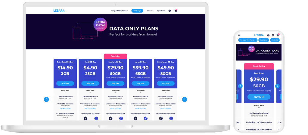
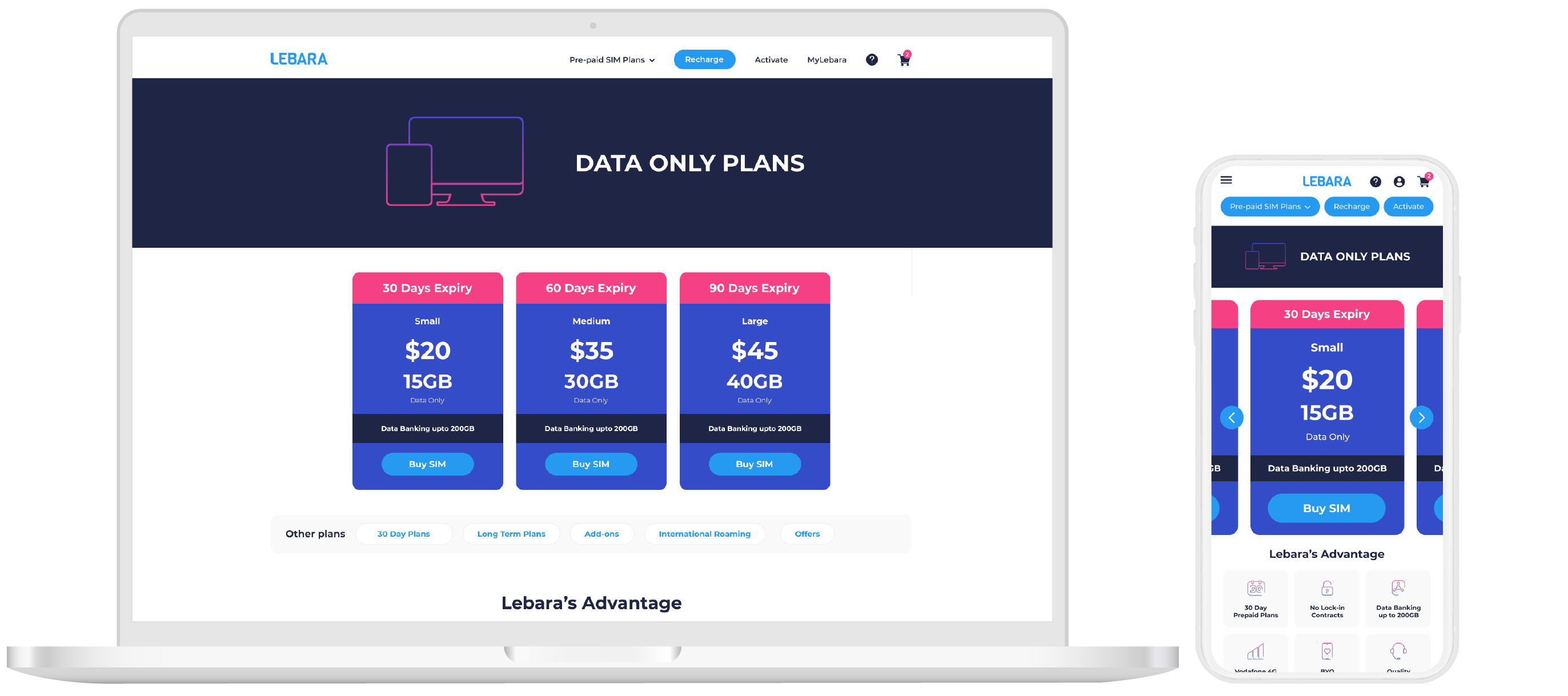
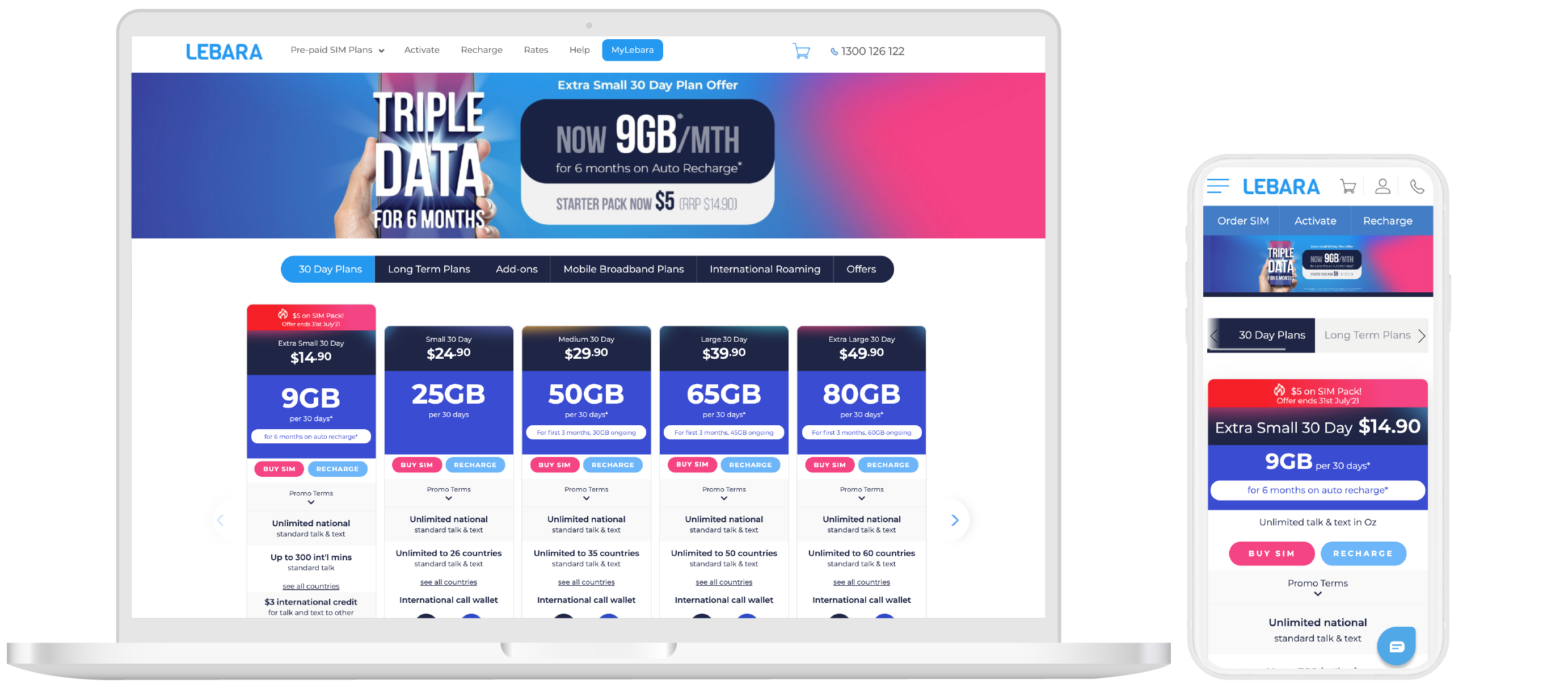
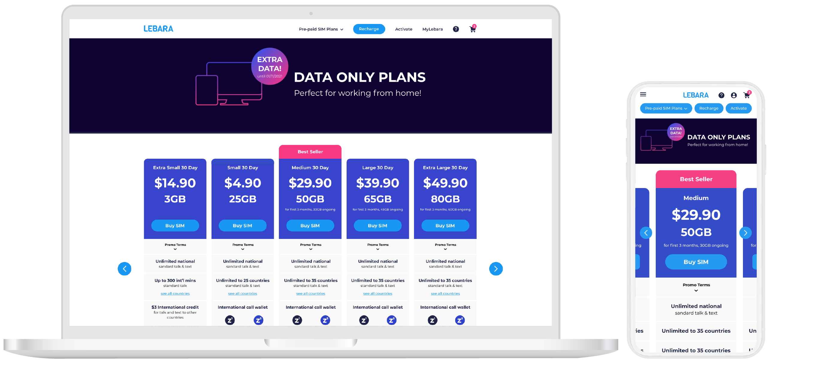
Users typically look at other plans when they are on the 30 day plan page.
Google Analytics show us that users who convert on the 30 day plan page have visited other plan pages or end up visiting other plan pages. Heat-map data also show that the “Long Term Plans” button is the most popular when on the 30 day plan page.
Desktop
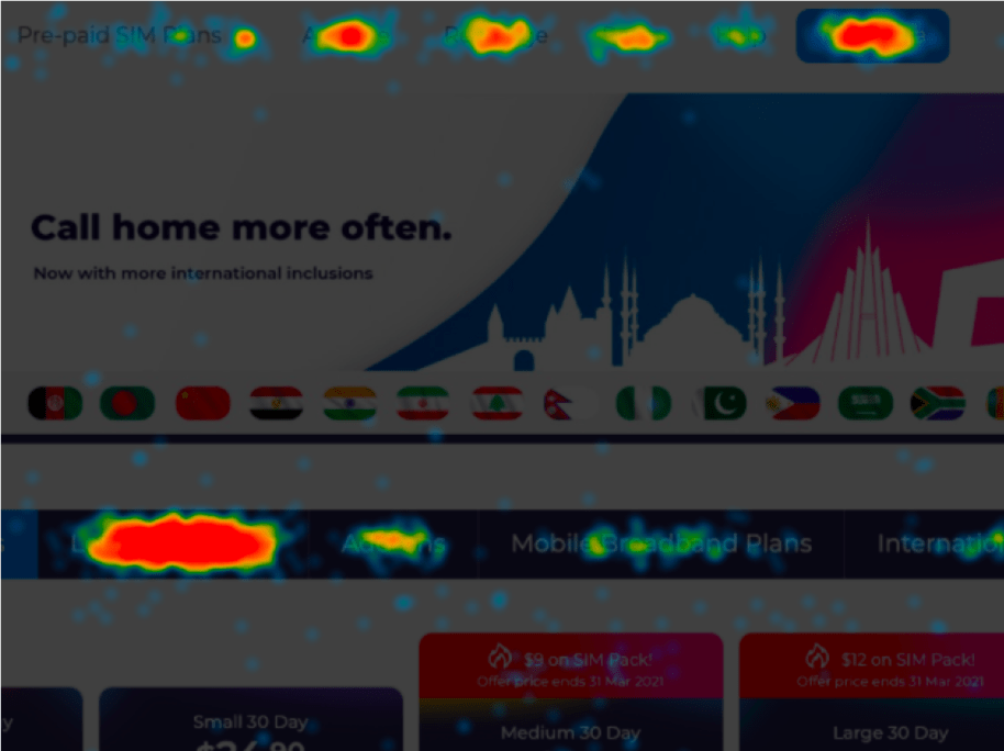
The most popular hotspot of clicks is on Long Term Plans with 24.6% of clicks
Mobile
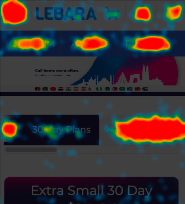
The most popular hotspot of clicks is on Long Term Plans with 16.9% of clicks
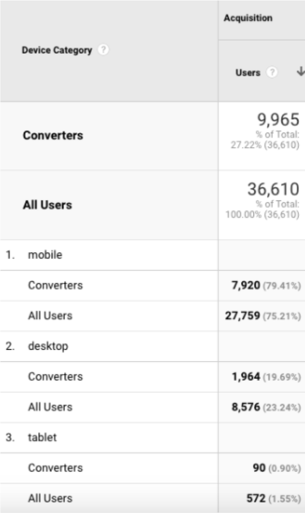
Majority of our users use and convert on mobile
18%
completion rate for desktop
11%
completion rate for mobile
Majority of our users are using mobile (75%), and also convert on mobile (74%).
There is a higher percentage of users who drop off the checkout process when on mobile compared to desktop.
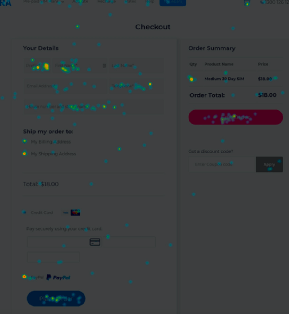
The Checkout Page has minor issues on mobile
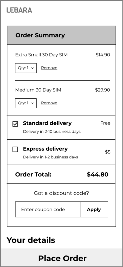
One example of the mobile checkout page issues is the cart having an additional order. On desktop, the most popular hotspot of clicks is the “Order Now” button (11% of clicks). The second most popular button is the “Edit Order” button with 9% of clicks.
Desktop
Mobile
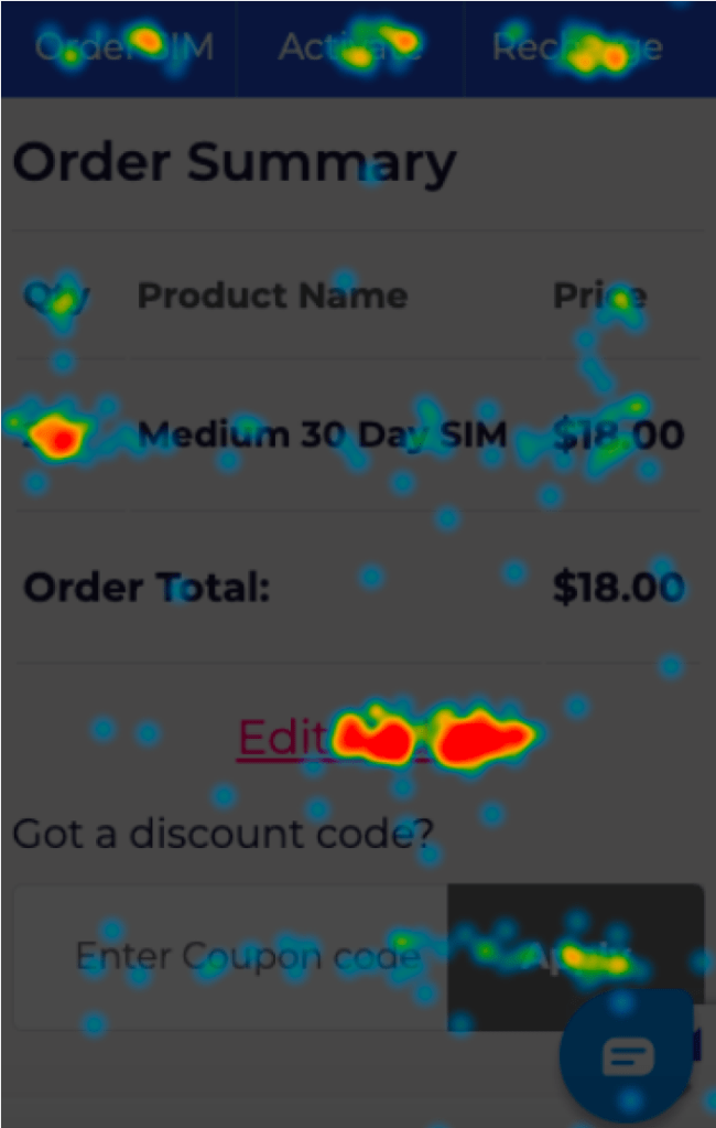
On mobile, the “Edit Order” button is the most popular with 13% of clicks, then the “Place Order” button with 11.6% of clicks. When we look at both devices, it appears that users typically see a quantity of 2 Medium 30 Day SIM’s. We could conclude that the cart easily has 2 products when there should be 1, and that the user needs to take an extra step to edit their order.
Proposed Solution
1- Optimise the visual hierarchy of headers on the 30 day plan page for both desktop and mobile.
By auditing the UI and doing a competitor analysis on the 30 day plan page the aim is to make it easier for users to select the best plan option for them rather than presenting too many options.
For example:
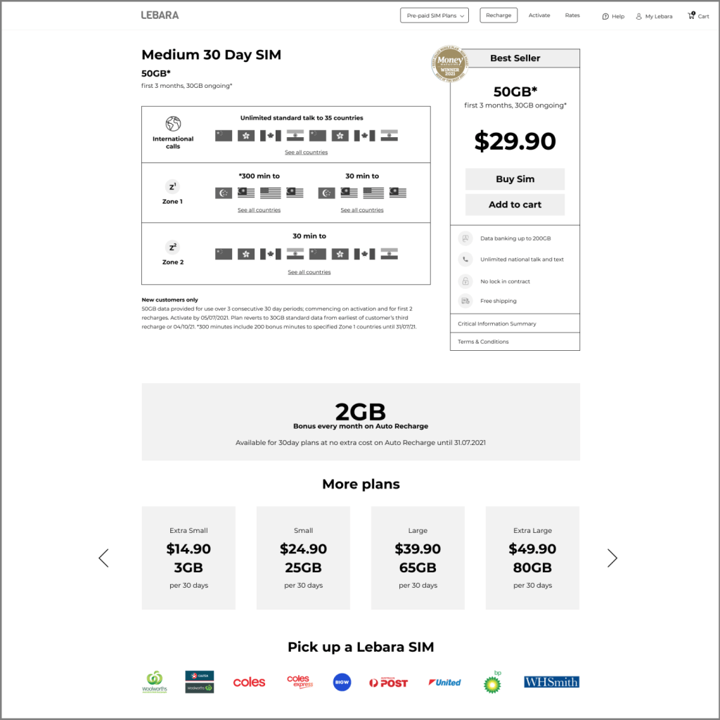
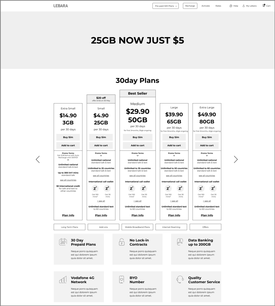
for the Brand New User, even when they are just about to purchase, they are presented with options again.
It is best to carve out a clearer path for our brand new user to buy SIM, by eliminating unnecessary options so that we can help the user buy the right plan without having to think too hard.
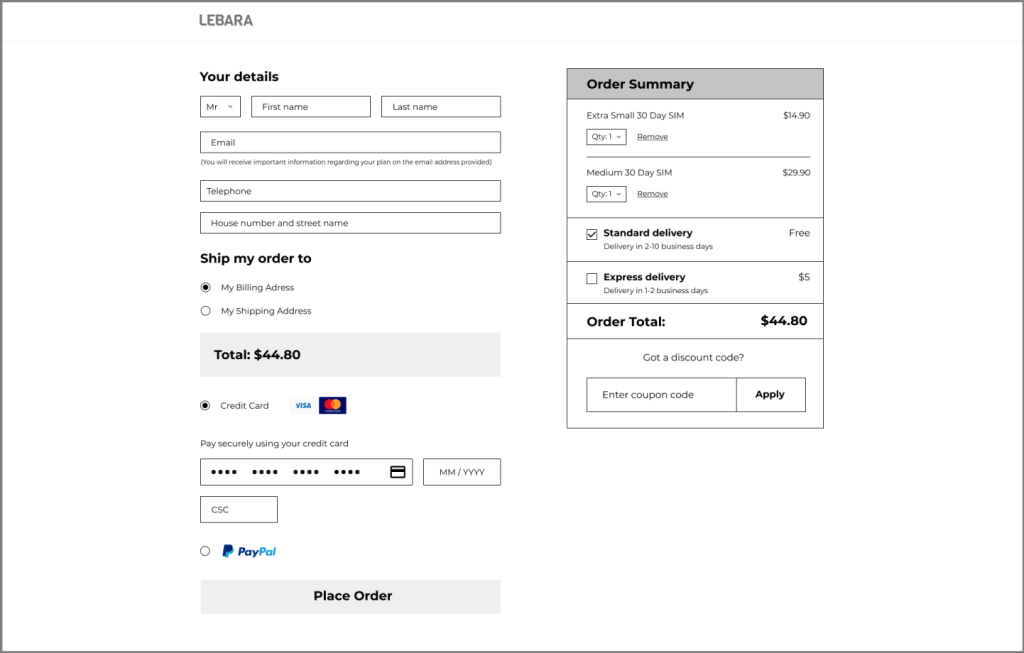
2- Design with a mobile first approach.
We recommend that we do a UI audit on the checkout process and improve the checkout rate on mobile. One item we can consider adding is enabling the option to edit order with more ease, especially on mobile, or find a solution to prevent from extra items getting added by accident.
Desktop Wireframes
Mobile Wireframes
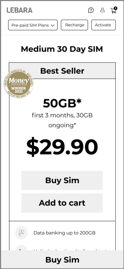
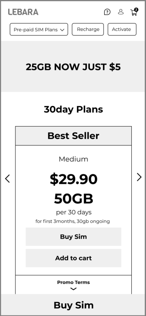
Final Mock Ups
30 Day Page
Visual hierarchy:
- Removal of recharge button in order to lessen the confusion for new customers. Recharge is instead highlighted on the top menu to cater for existing customers who may have relied on those buttons deleted.
- Simplified the top menu and removed sub-menu under page banner. This was where a large percentage of people were jumping between particularly the 30 day and long term plan pages. While this might be good for avid shoppers, it adds to the drop off rate. The solution is to move the sub- menu below the plan carousel and to simplify the top menu.
- Minimal use of colour to separate sections of the plan in order to keep focus on Price, Data and the Buy SIM button.
- Larger and more visible Plan info button previously hidden.
- Padding adjusted in order to give more breathing room between lines of text.
Checkout Page
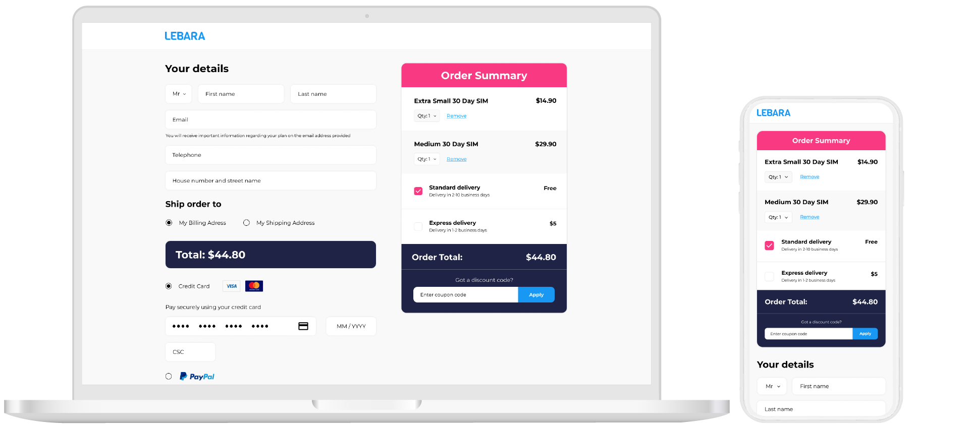
Mobile first approach:
- Create a mobile friendly version by having a fully editable cart without having to go into an inner page just to adjust QTY of order.
- Clear shipping cost and total.
- Give the customer the ability to choose express post and have a dynamic delivery estimate for accurate delivery times.
Next Steps…..
User testing
Results and optimisation recommendations
