Role:
UX/UI Designer
Client:
TPG TELECOM
Background
JUST QUICKLY WHAT IS LEBARA?…Lebara is an established subsidiary of TPG Telecom providing telecommunications services since 2008.
Design Goals
To create a native app for both customer onboarding and account management.
Scope
– Keep three plan pillars (plan expiry, monthly data balance, Data Bank balance) visually clear at a glance.
– Review current journey and minimise the steps to get customers onboard and to recharge
– Create a dashboard to accomodate for different plan features.
Current Lebara app
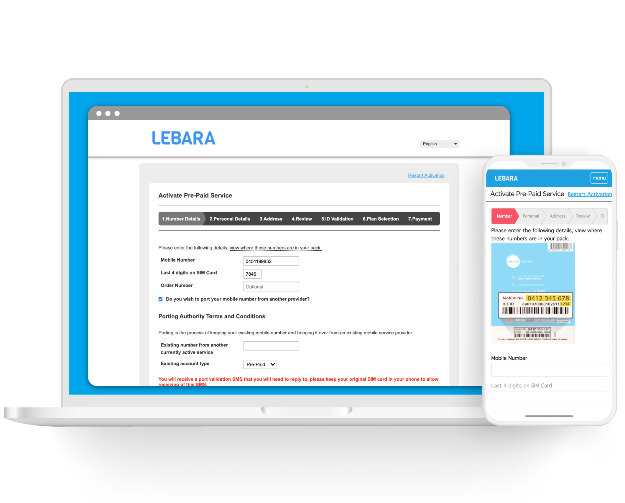
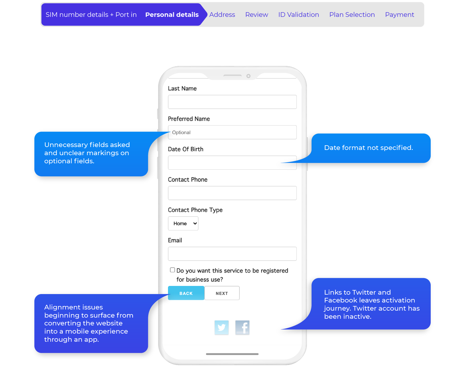
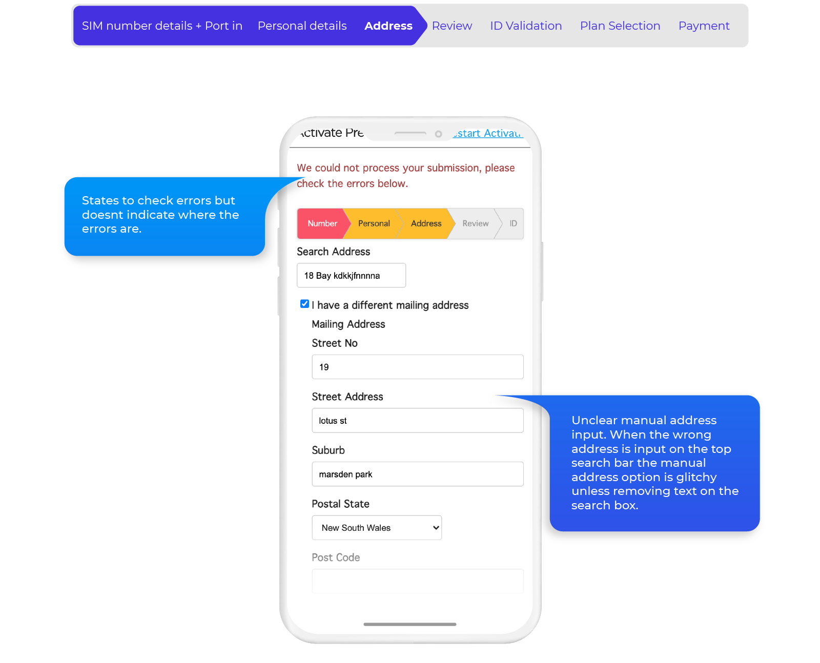
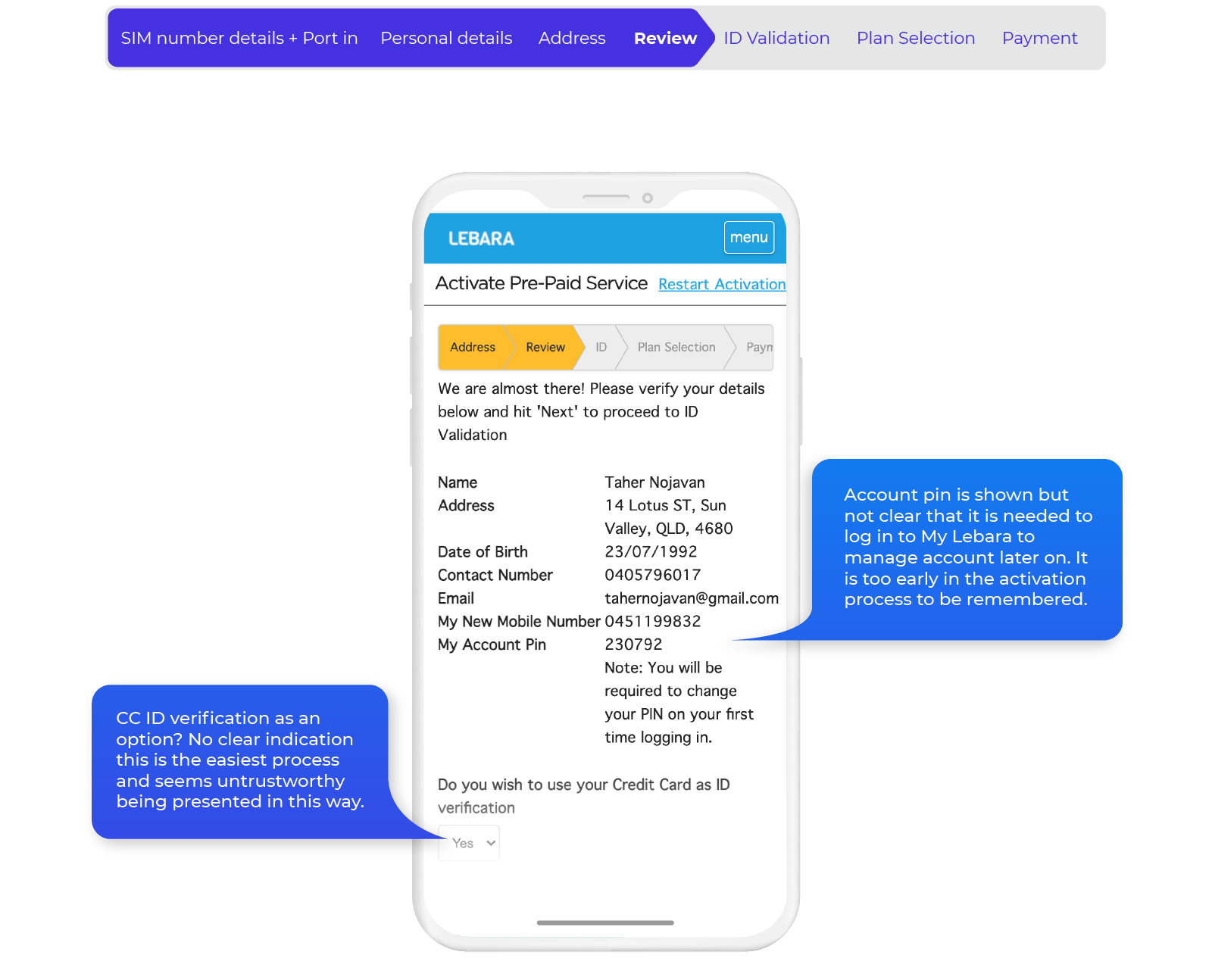
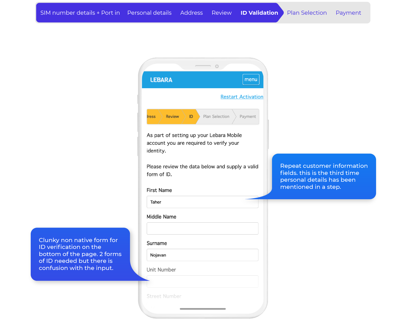
The existing app solution for Lebara is a mobile render of the current website flow. This means it is not native and is essentially a browser to the website.
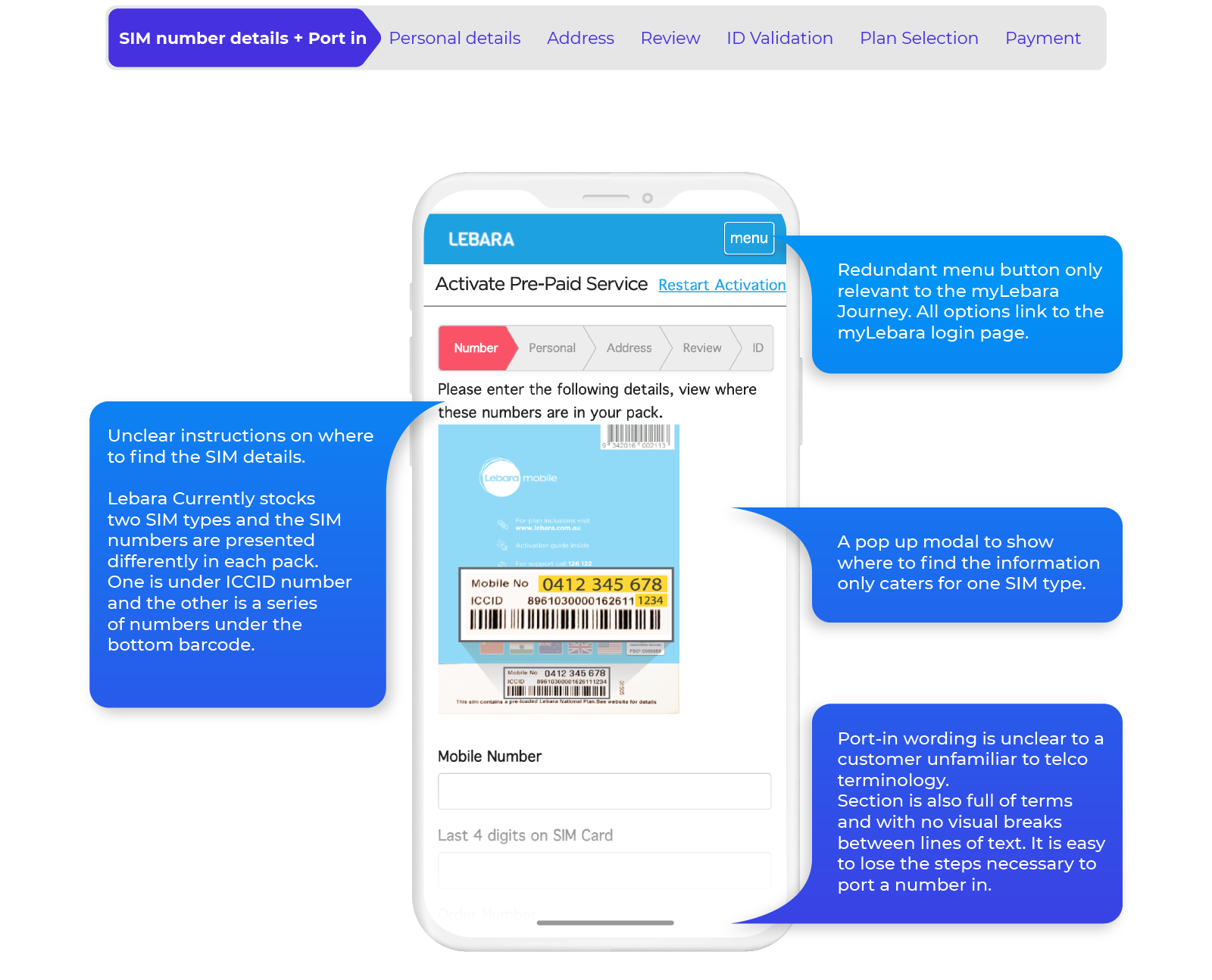
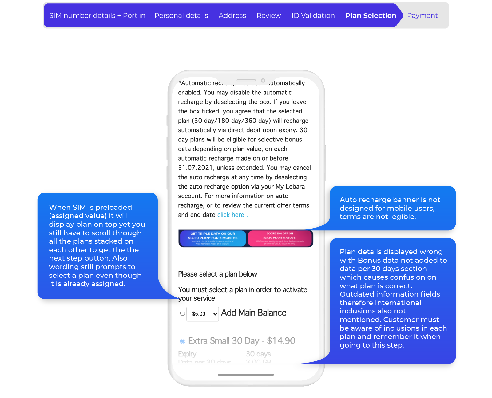
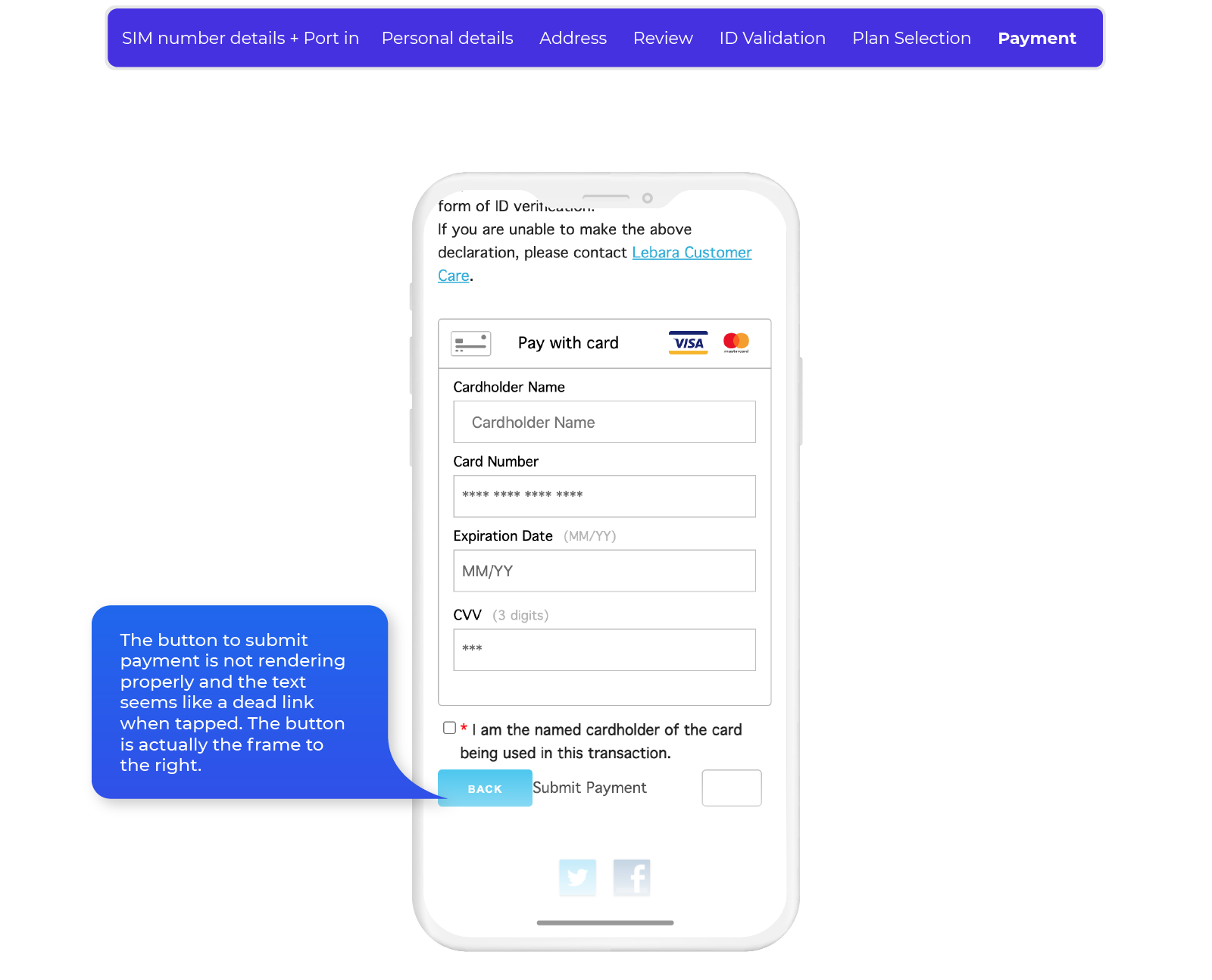
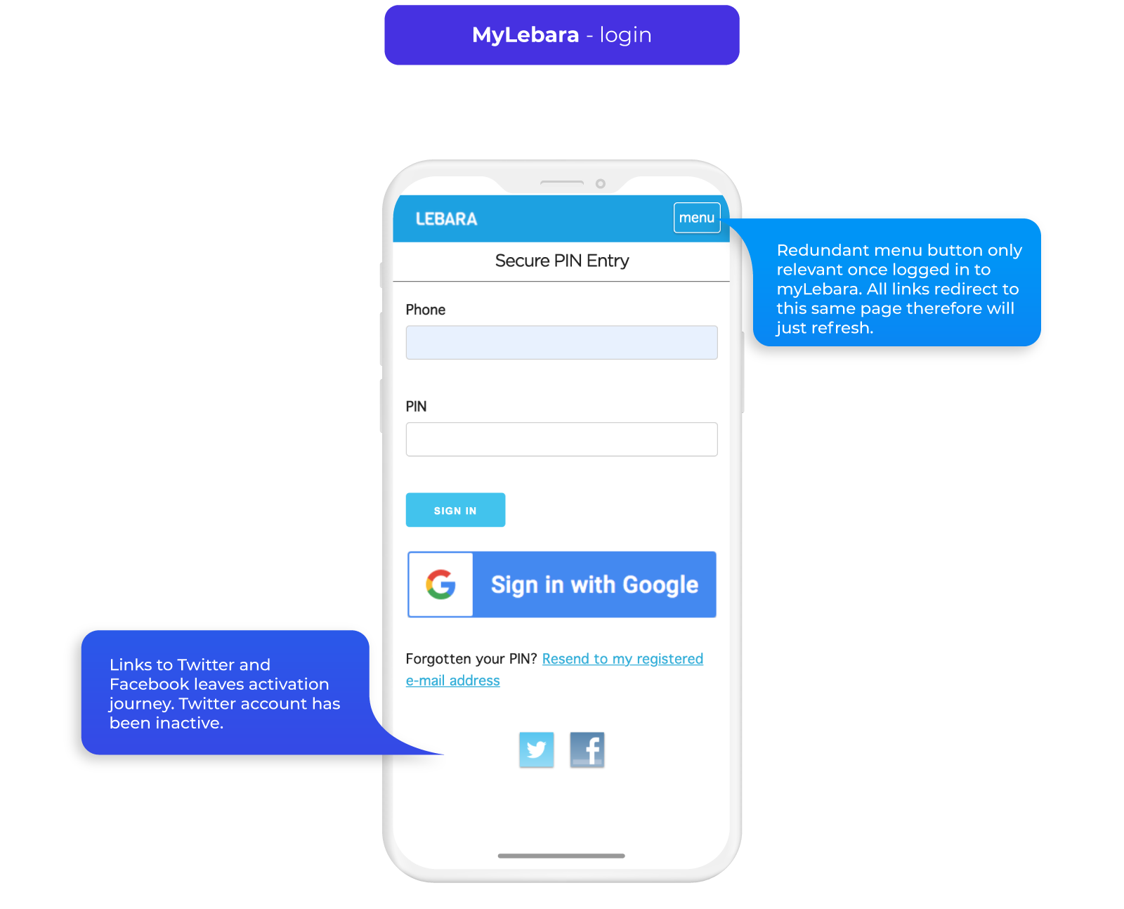
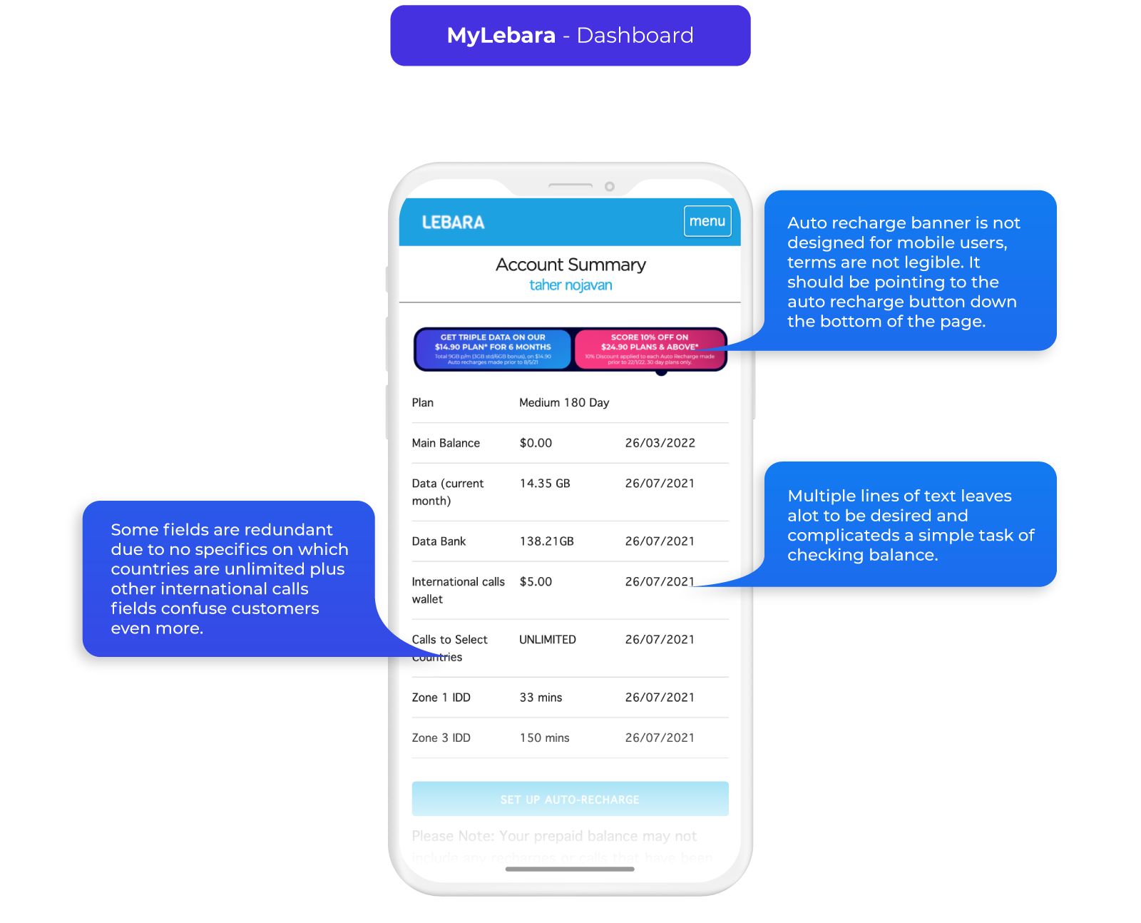
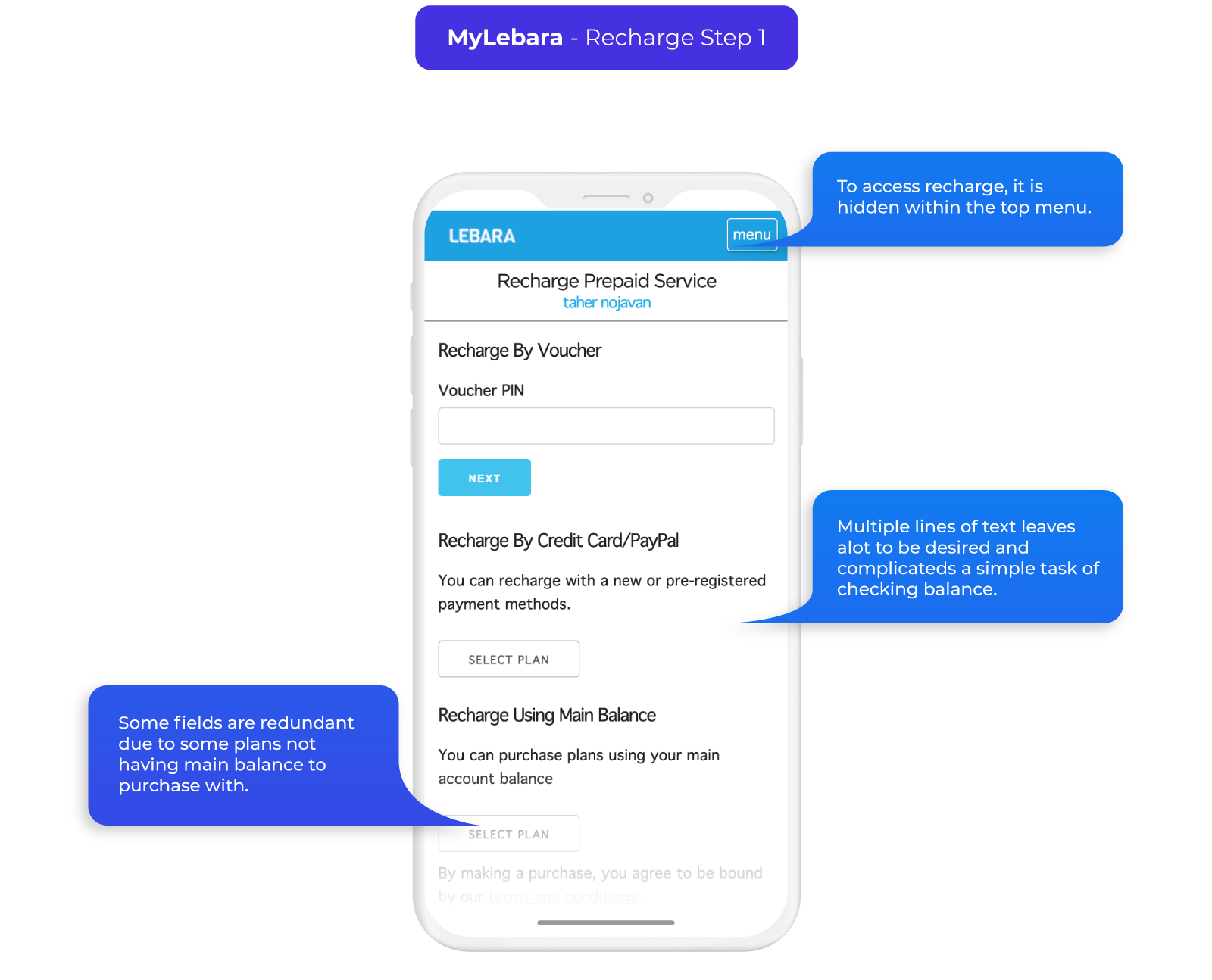
Activation/MyLebara Flow Pain Points
The key to reducing the steps is figuring out which are necessary both in what is needed to create an account and what is legally required. To do this we split up the stages into service requirements, customer requirements and legal requirements then reviewed each step to find pain points in all aspects of the UX.
Key Takeaways/Requirements
- Address all pain points and remove redundancies in the current journey.
- Reduce the steps in activation by only keeping the necessary Account and Legal requirements.
- Create a visually clear MyLebara experience with information on Key plan feature pillars: Expiry, Data Banking and Data Usage.
Initial mock ups
Final Outcome
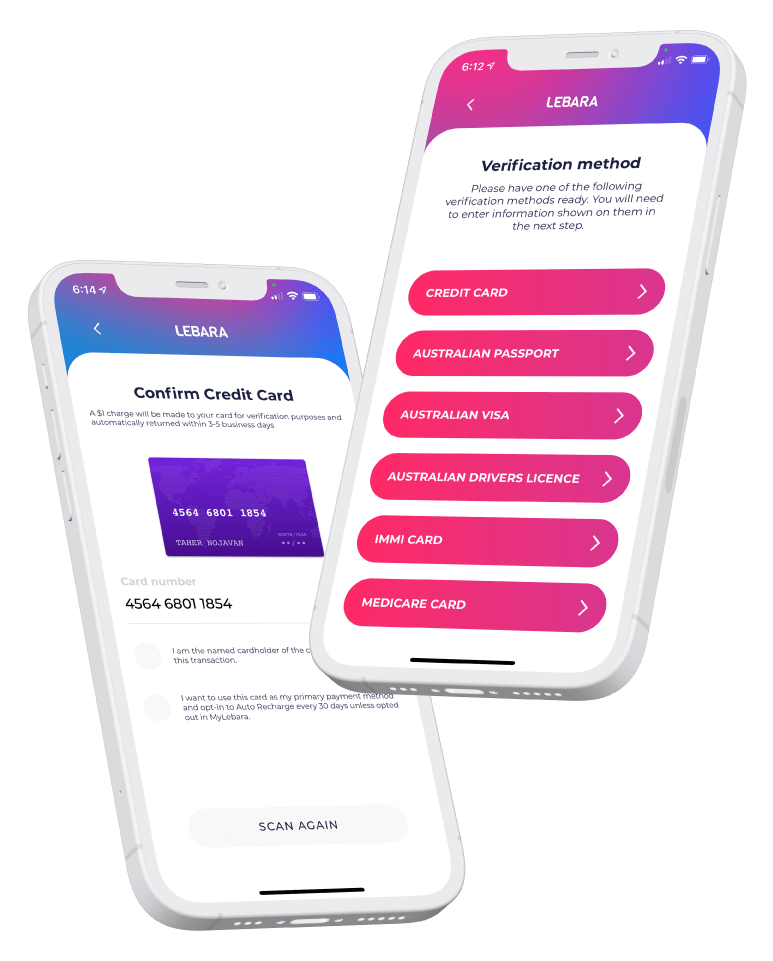
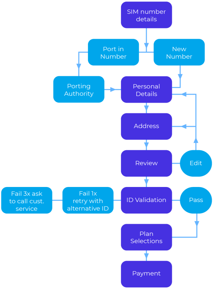
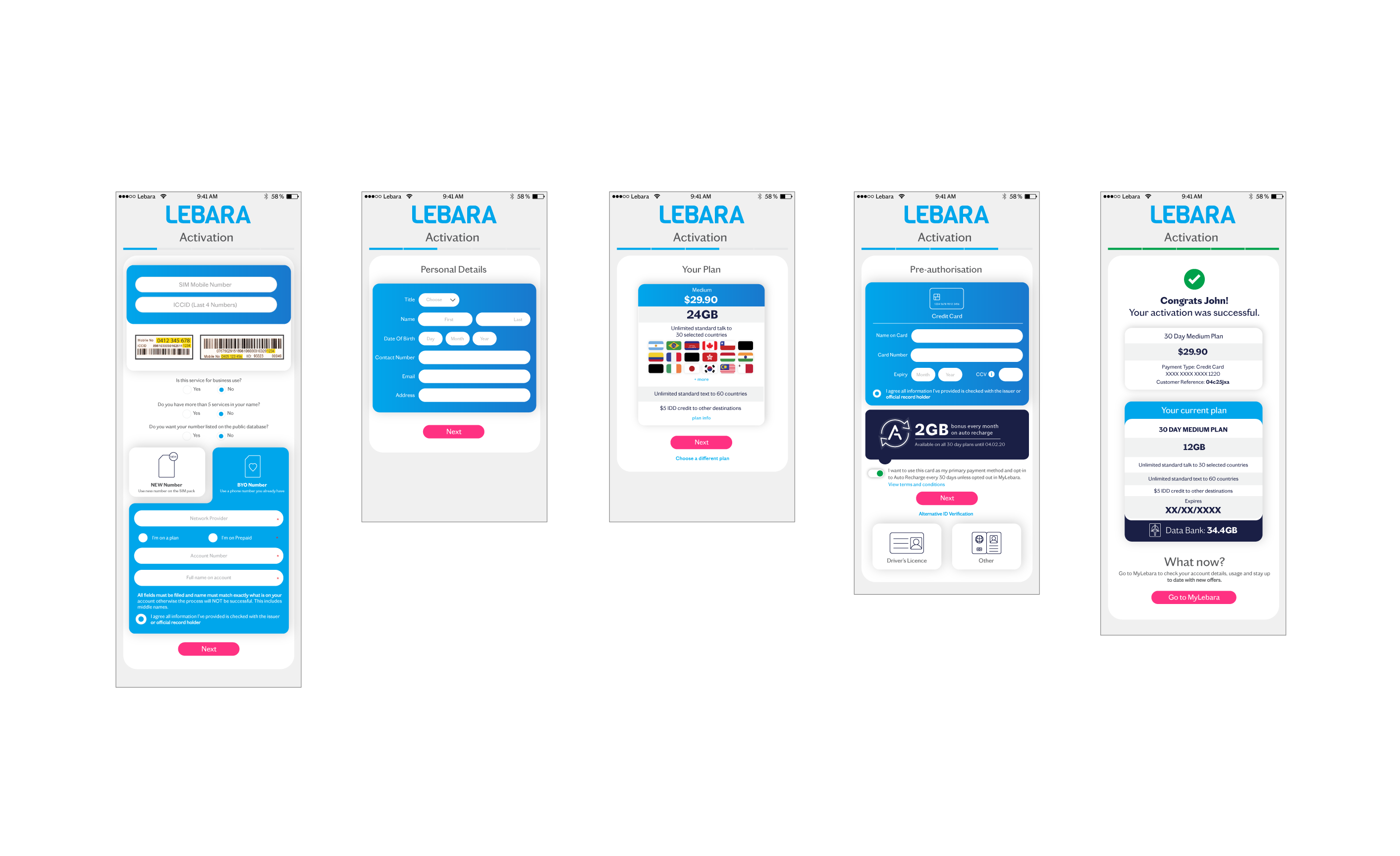
Activation
Old activation flow:
SIM number details + Port in > Personal details > Address > Review > ID Validation > Plan Selection > Payment
New activation flow:
Scan sim > personal details > Address > Choose existing number or port in > Choose plan > Payment
Activation is now reduced to 6 steps cutting the Green ID verification through combining it to payment and removing plan confirmation. This means a customer can get activated in under 3 minutes.
Scanning SIM saves time on manually inputting 12 digit ICCID number and is also used for credit card input.
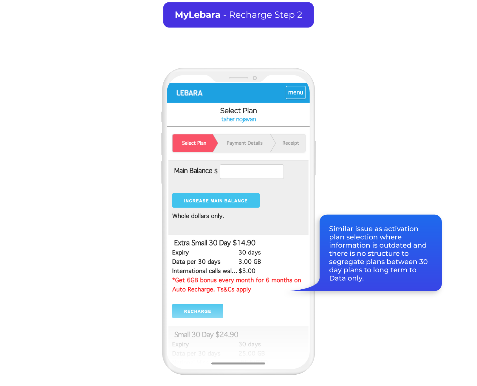
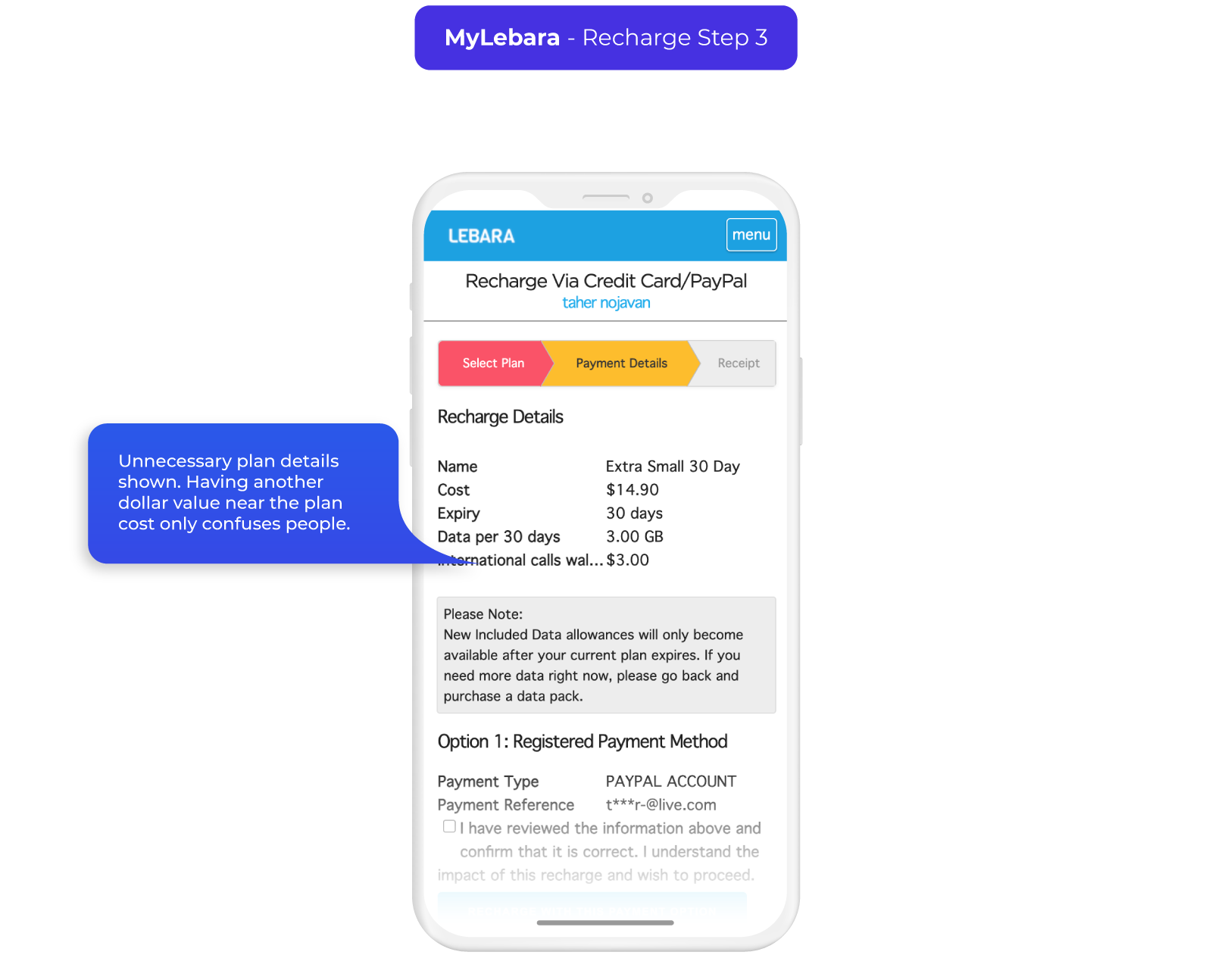
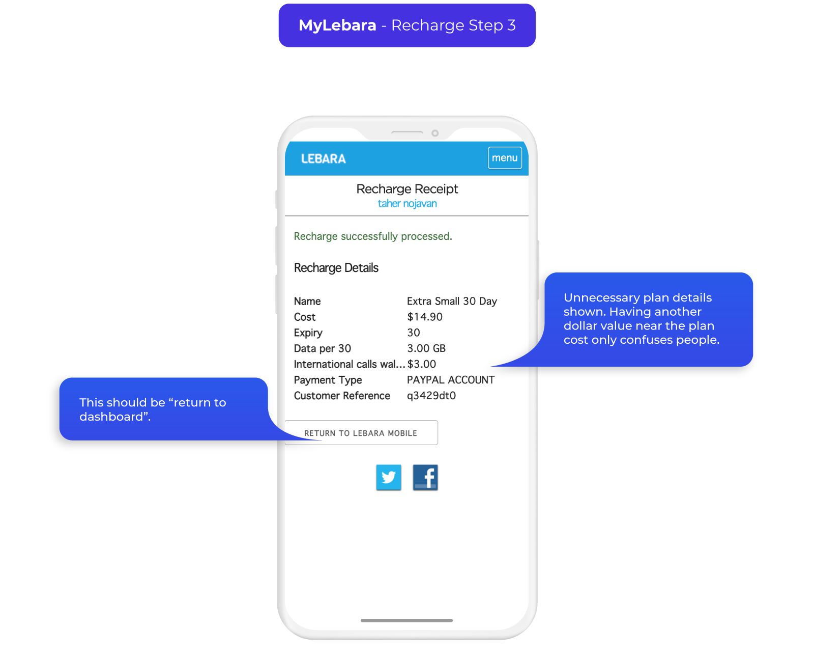
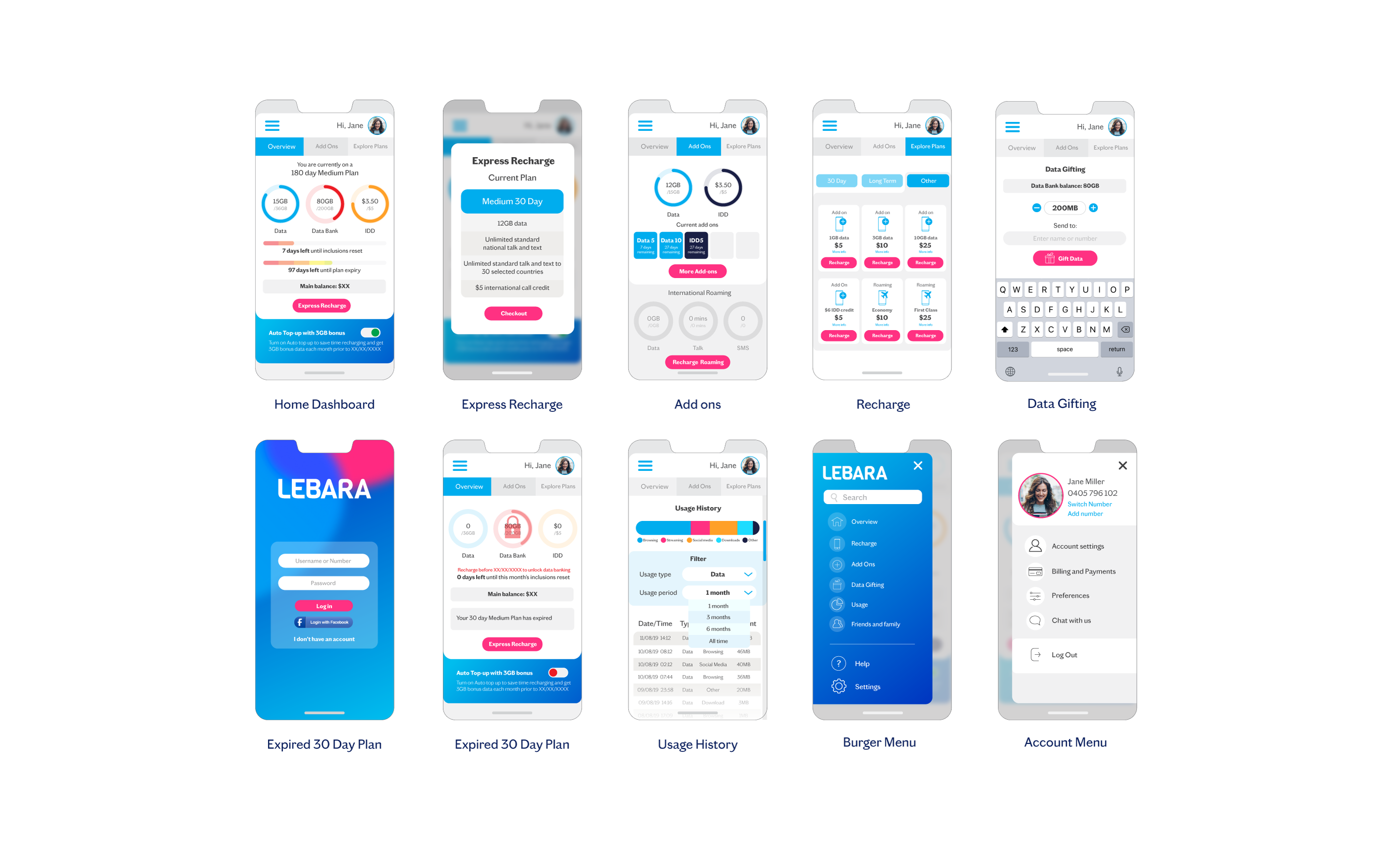
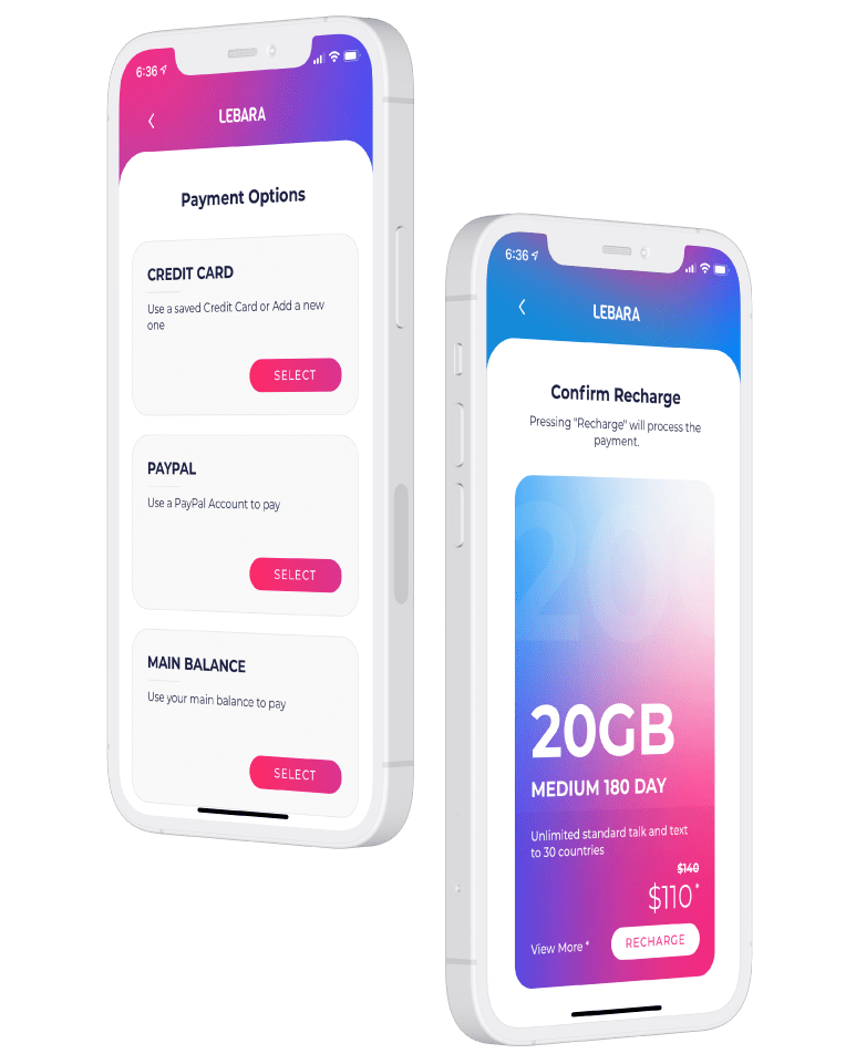
Recharge
Old recharge flow:
Recharge > Payment method > Select plan > Confirm recharge > Input payment details
New recharge flow:
Recharge > Select product family > Select product validity type > Select product > Payment options > Input or confirm payment details > Confirm recharge
While the new flow has 7 taps to complete a recharge compared to 5, there is a significant amount of time saved in the plan selection step as the plans are grouped into corresponding families.
Express Recharge option means it takes just 4 taps to recharge your plan by cutting out the plan selection and picking your current plan.
Express recharge > Payment options > input or confirm payment details > Confirm recharge
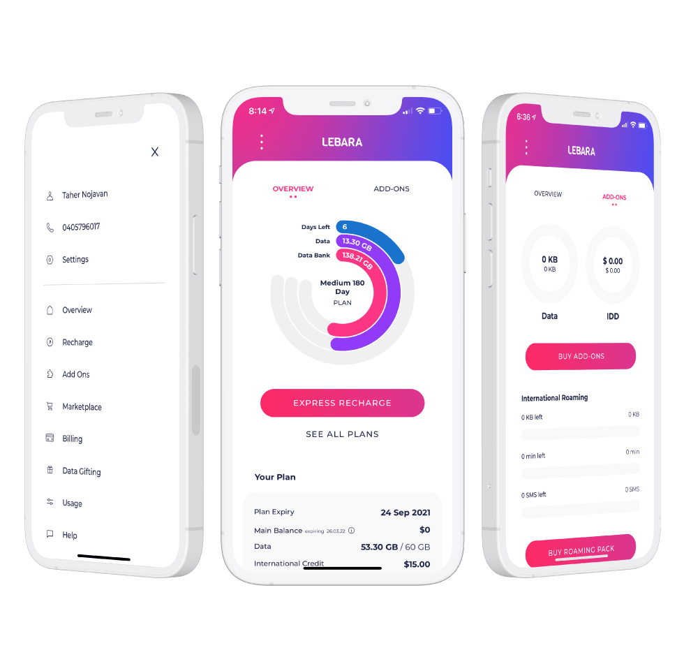
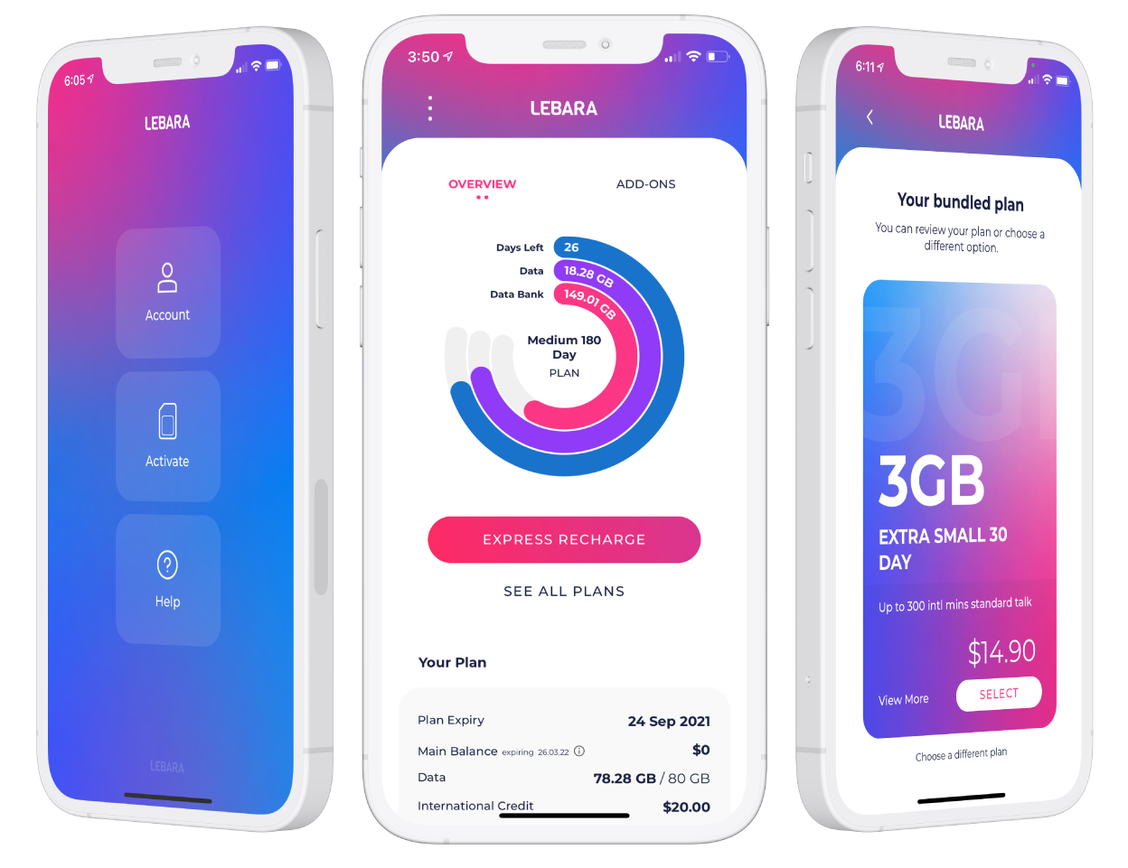
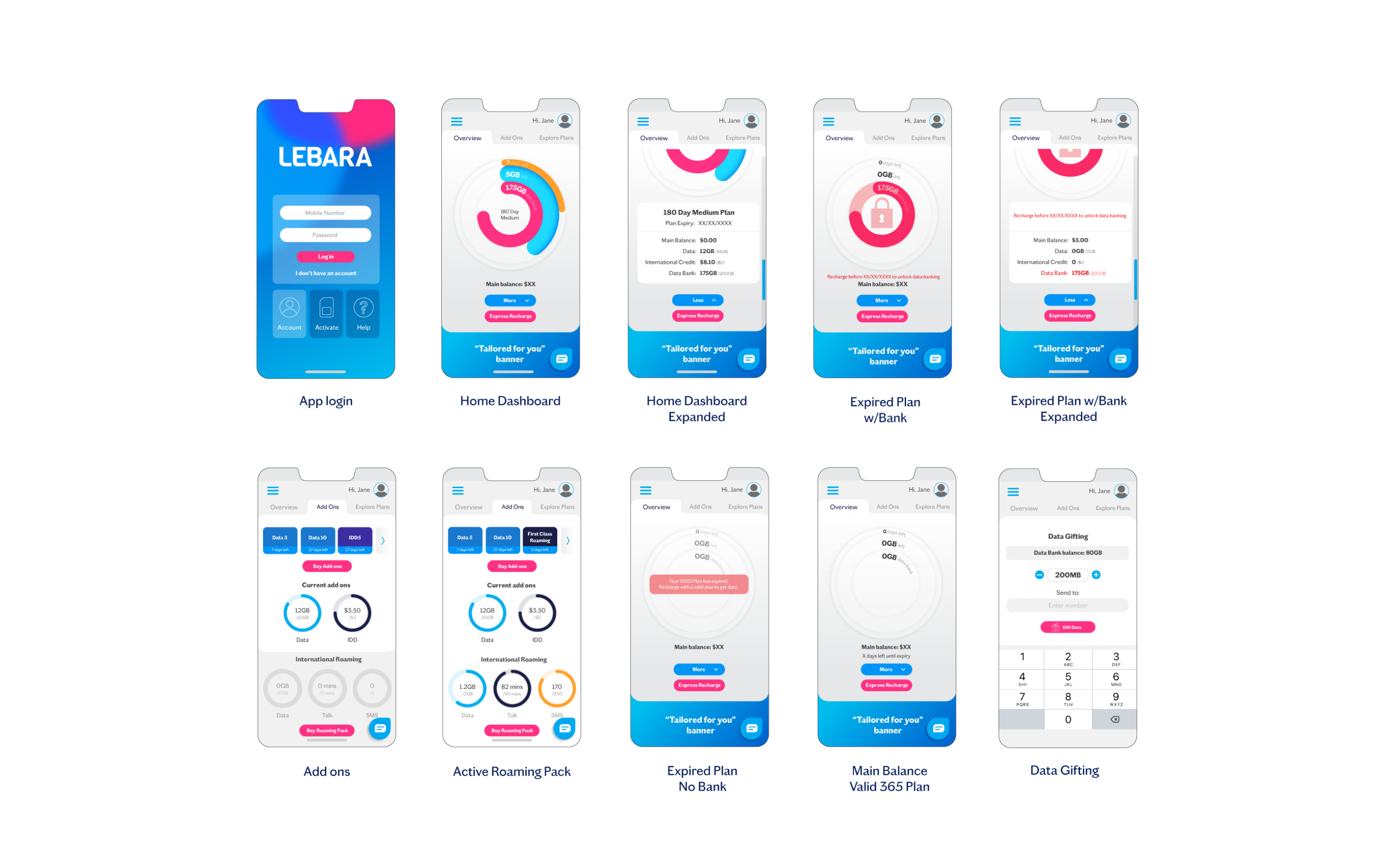
Account Management
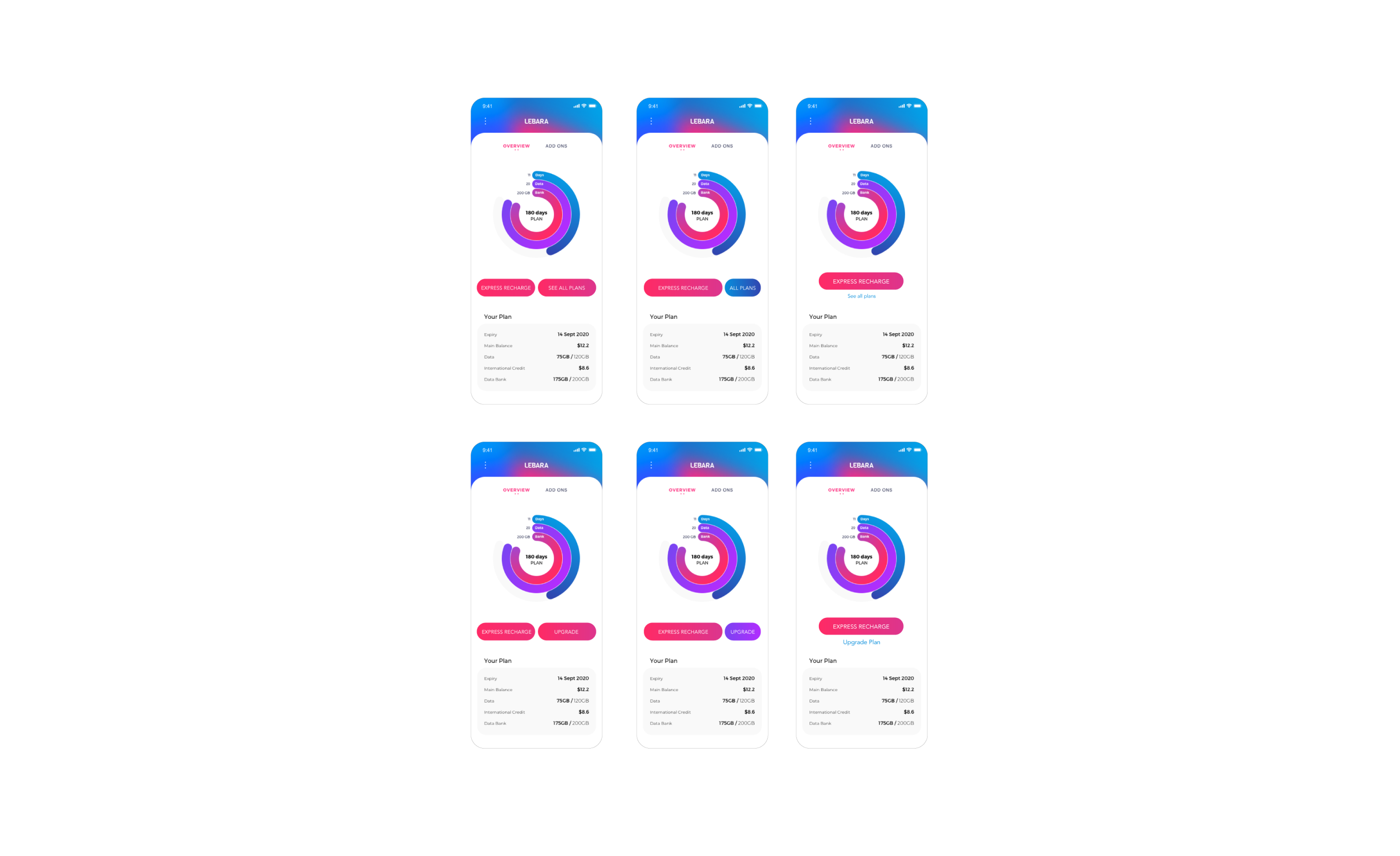
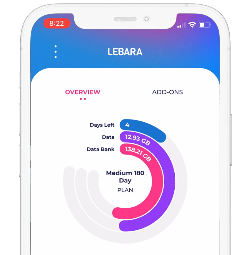
- Overview page with visual representation of three plan pillars Expiry, Data allowance and Data Bank using donuts.
- Separate tab for add ons caters for Data and Credit additions plus Roaming product details.
- All features and functionality available from the MyLebara page is now available in app except SIM swap (lost or broken SIM replacement).
Animation and design
Created with the ease of legibility and simplistic natural feeling UX in mind, the design is based on a minimal aesthetic using brand colours to create punchy interactive zones and information in contrast with the white background.
Using donuts to show plan features makes it easy for a customer to log in and see at a glance that they still have time before recharging or have used up their data.
Animation is used minimally with subtle, smooth movements to create a sense of fluidity in the interactions.
Feedback
App Store
4.2/5
Majority of positive comments come from the simple user interface and ease of use.
“Hats off to Lebara for creating the most simplistic and user friendly app I have seen in a long time. The usage meter and express recharge makes a the whole experience for prepaid mobile stress free.”
BriefcaseMon
★★★★★
Negative reviews vary from service issues (non app related) and with case by case glitches on the ID verification option for non credit card users.
“Works smoothly till you get to the ID. Though it gives you many ID options, Medicare, drivers license, etc NON work, it will only allow you to register with a credit card nothing else.”
Mr Spockstar
★☆☆☆☆
Google Play
3.6/5
Majority of positive comments come from the design and features.
“Looks and feels fantastic. I love this simple amazing app.”
Ada
★★★★★
Negative reviews seem to be some bugs with ID and log in. This was always expected with Android covering so many different device types. There are also requests for features such as widgets and family accounts.
“Annoying theme. You don’t have basic copy/paste editing. Worst app.”
Johnny W
★☆☆☆☆
Update: this feature has been updated to include copying and pasting numbers on login.
Takeaways and improvement opportunities
Consider multiple service management under one account (family plans)
Addition of SIM Swap feature – currently the only functionality missing in app.
Optimise for more Android devices and fix bugs within ID verification
Long term plan inclusions breakdown – Currently the overview page doesn’t clearly state data per cycle and total data in your plan confusing customers.
