Role:
Lead Product Designer
Client:
KPMG Origins
Background
Building and construction accounts for almost 40% of global emissions by sector, and while there are many ways to calculate the operational emissions of a building, there is a lack of clarity on project embodied carbon. With consumers increasingly demanding that the building they occupy are carbon neutral or net zero as well as governments commitments to reach net zero by 2050, the need for a standardised tool of capturing as built carbon emissions is more important than ever.
Design Goals
The NSW government engaged KPMG to expand on the Building trustworthy Indicator to provide an Embodied carbon calculator for as built assets. This tool will capture data from multiple personas in the building process in order to accurately show the embodied carbon content of a building bringing to light the practices and material choices of developers and builders.
Scope
– Understanding the current landscape
Partnering with an external party to desktop research on market reports and organisational share backs, as well as primary research through industry workshops, interviews and testing on the current landscape around embodied carbon.
– Persona mapping
Identify key persona groups, their pain points, and understand ECI value proposition.
– Ideation and prototyping
Using discovery exercise findings and in the lens of key user persona’s build user journeys, features and product screens.
– Final designs
Finalise features, establish design components and handover final designs to developers.
Current Landscape
The construction industry is a major contributor to the global greenhouse gas emissions. Taking meaningful action now is critical to tackling the global warming and climate change crisis.
39%
of global greenhouse gas emissions are attributable to buildings, including operational and embodied
11%
of carbon emissions comes from just the embodied carbon in the built environment
<1%
of building projects currently calculate and report their full carbon footprint
Controlling operational carbon has well-established reduction pathways, however, the more complex nature of embodied carbon has made implementing reduction strategies challenging. There is significant opportunity to standardise the measurement of embodied carbon in the built environment.
“As Designed” vs “As-Built”
Whilst the highest impact of embodied carbon reductions can be made at the design stage, As Designed data does not account for the reality of construction. With inevitable material changes that occur in construction, As Built data is the next step to accurately capture a building’s true upfront emissions footprint.
Proposed Solution
The Embodied Carbon Indicator (ECI), a market-led digital product which will enable the measurement, verification, benchmarking and reporting of upfront embodied carbon in new buildings.
Key features and value propositions:
- Calculates the building’s upfront embodied carbon emissions using data about all materials used in the building.
- Standardised measurement of portfolio buildings by using CO2 emissions per m2 in addition to total CO2 amount for the asset
- Benchmarked against other buildings in the same building class.
- Improved calculation accuracy by combining supply chain data, latest Environmental Product Declarations and a rich set of generic emissions factors
- Helps developers minimise their total carbon footprint, by understanding the impact of embodied emissions on their buildings portfolio, and enabling them to take actions for future projects to reduce the embodied emissions to a minimum.
- The key value proposition is to create a trusted view of upfront embodied emissions, allowing the organisation to make well informed and accurate offsetting decisions to hit their Net Zero targets.
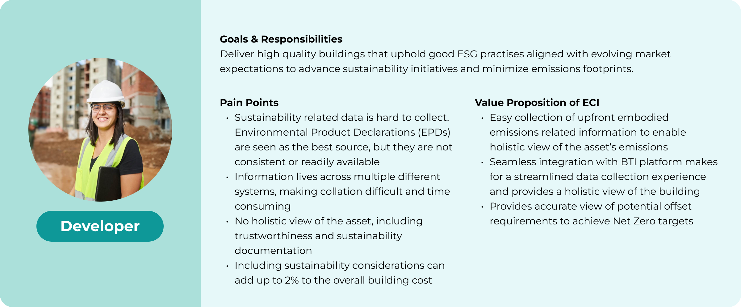
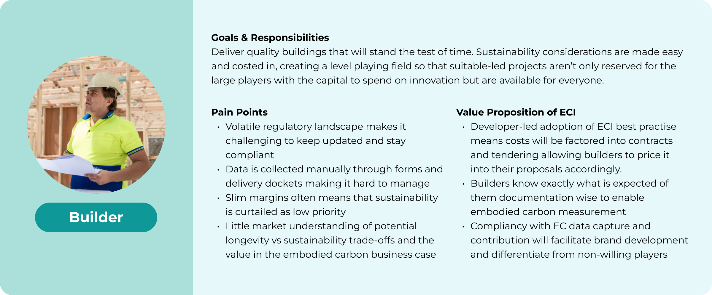
Target User Personas

Developer

Builder

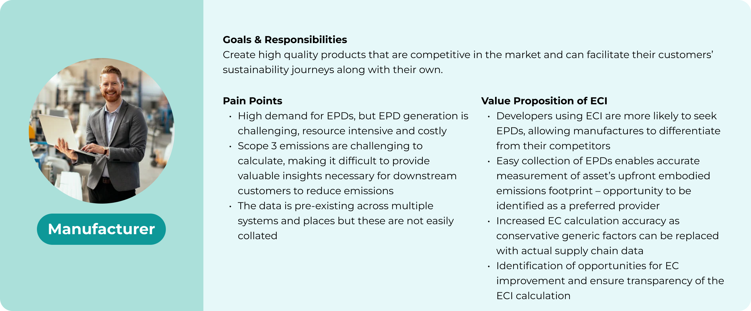
Manufacturer
Persona Interviews
20 recorded interviews conducted across a range of participants fitting the three core persona groups in the Australian built environment with all insights captured by the team and clustered them using affinity diagrams to extract key themes and pain points.
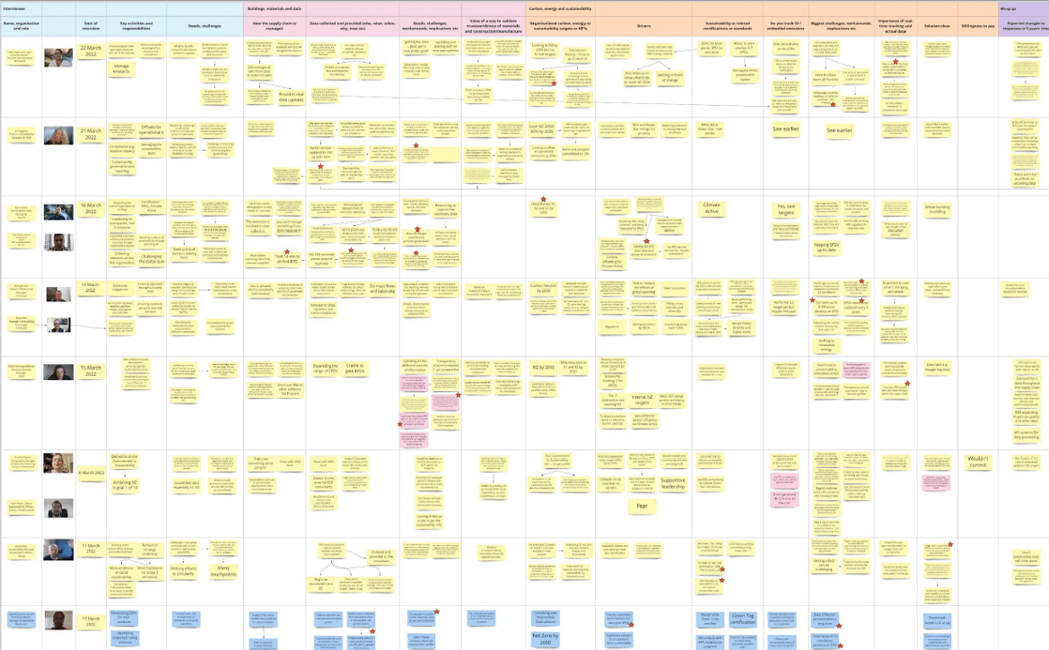
Persona profiles based on Interview findings
Product Concept Testing
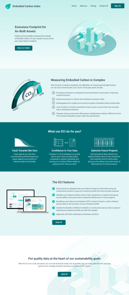
Embodied Carbon Indicator
The objective of this exercise is to present these prototypes in interviews with key personas to seek feedback on the ECI concept and to ensure the value proposition addresses the problem. It was created with assumed problem statements, pain points, solution descriptions, feature descriptions and a CTA.
Rating and feedback method
Interviewees were presented with the lo-fi MVP and asked to review from top to bottom and then capture their initial reaction.We then talked through each section to get feedback using emoji’s to identify likes, dislikes, or confusing elements.
At the end the participants were asked to score the idea on a scale of 1-10 and explain the reason for their score.
Key Insights
Generally most stakeholders didn’t see carbon data as an immediate need. The tool was seen as limited if it just focused on as-built as the real value in understanding (and reducing) carbon is at the design stage.
As a specialised tool it should not be just about carbon – needs to include other aspects eg. water, modern slavery, recycled content, recyclability to make it a stronger value proposition.
Scored fairly low on our scale at 4.4/10
Reworked concept
With a lot of concern about the lack of value in a calculator that, although a little harder to do at the moment, can be done already, the theme of needing a larger ecosystem of features stood out and so we pivoted our concept to a more whole building focused idea. We already had a Building trustworthy index product created so it made sense to add that to the prototype and have embodied carbon as a feature that will eventually expand to whole life cycle.
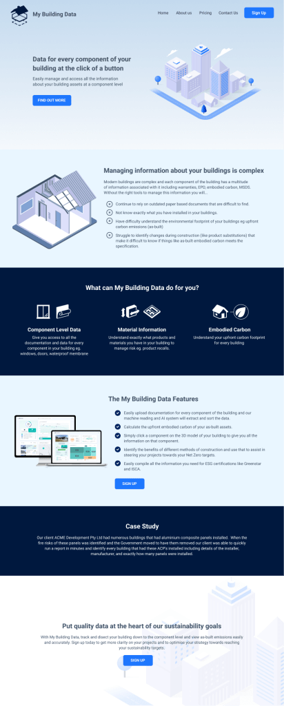
My Building Data
Using the same layout and format we reframed the carbon data as part of a more comprehensive building component data tool – as the ECI segmented the building into components, there are multiple data layers that could be applied to each component eg carbon, warranty, MSDS, manuals, etc. as well as the participants involved in the installation of the materials.
We also took into account comments about the difficulty in attaining all necessary data as they are stored in many places and often in paper form. This pain point was alleviated with a proposed delegation feature which allows all who interact with the materials (subcontractors) to also be able to submit data, spreading the workload to many participants.
Key Insights and feedback
Immediate positive response with comments that it clearly meets a need. Interviewees, can see value in a product that takes into account more than just carbon calculations and is some have come with suggestions on leveraging to show source of materials, modern slavery compliance and covering whole life carbon.
Scored highly in our scale averaging 8/10
Problems translated into additional requirements
- Difficulty of getting and submitting data: Rather than leave it to the developer to submit data, we should allow for delegation. This means all building participants need to be onboarded and be able to submit the required files.
- Initial data sources can be automated: With the industry moving on to Revit models, a list of materials can be derived from the file giving the tool a baseline of materials to compare or check off during build. Therefore a way to mark a material as built should be a key feature.
- Because there are concerns of Embodied Carbon not being important enough of an issue to create value from a calculator, the product should be expandable to both incorporate existing KPMG Origins products as well as potentially cover other ESG components. This means a whole of building view with the possibility to integrate our track and trace platform to build on the story of materials that go into the building.
Initial Ideation
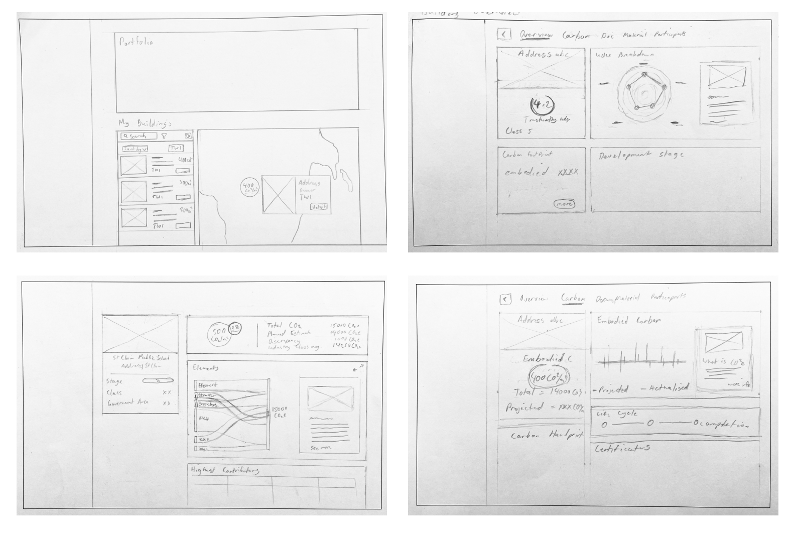
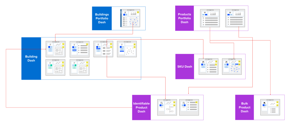
Fitting within the existing products
While the dashboards were simple enough to ideate on as we knew what data is most valuable (pending further validation), the main challenge was fitting it into the current suite of products. This expanded the scope to also consider navigation improvements both in hierarchy and in UI navigation.
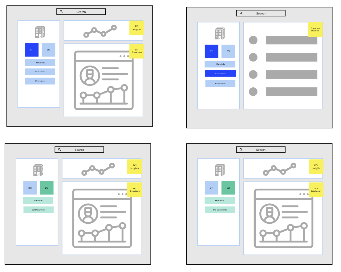
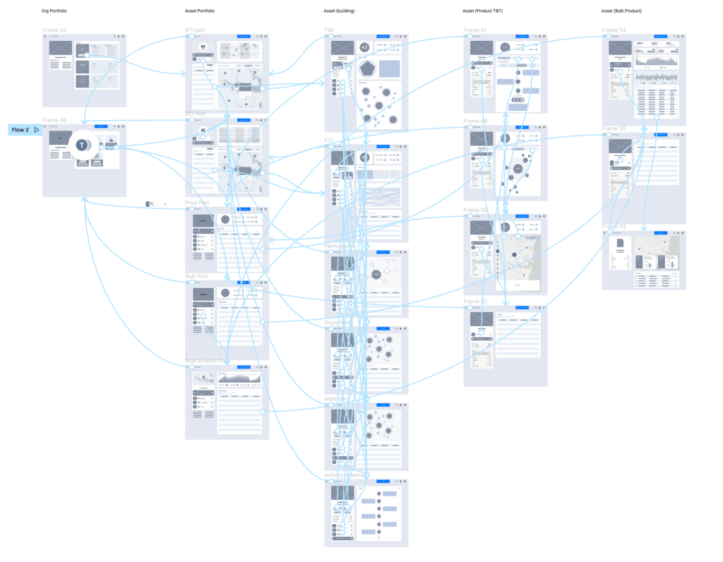
Navigation testing
I created the core screens on Figma and created a lo-fi clickthrough prototype highlighting the navigation between pages. Using method of heuristic evaluation, I gathered 11 team members of varying exposure and experience to the product to complete simple user goals to see key pain points with the new navigation.
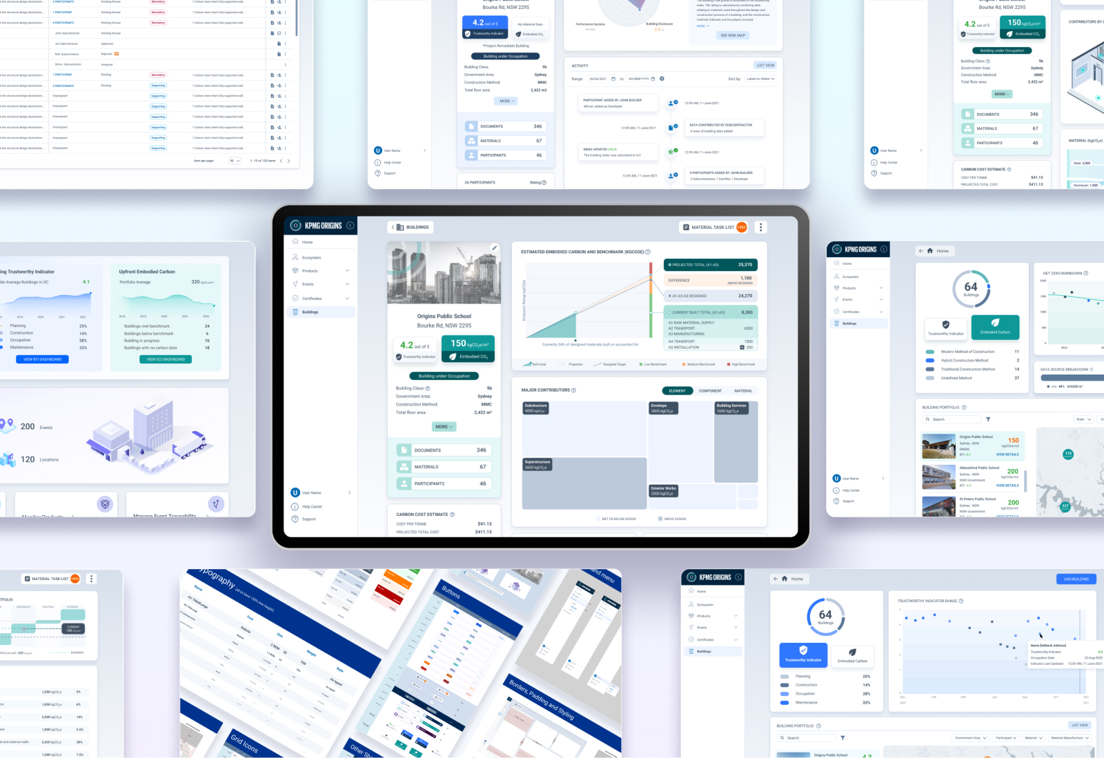
High Fidelity Screens
Once the navigation and content for each screen was agreed upon we began to create the high fidelity screens for further validation with users. This gave a clearer picture of the type of data they will consume and how they will consume it as well as details on data entry flows.
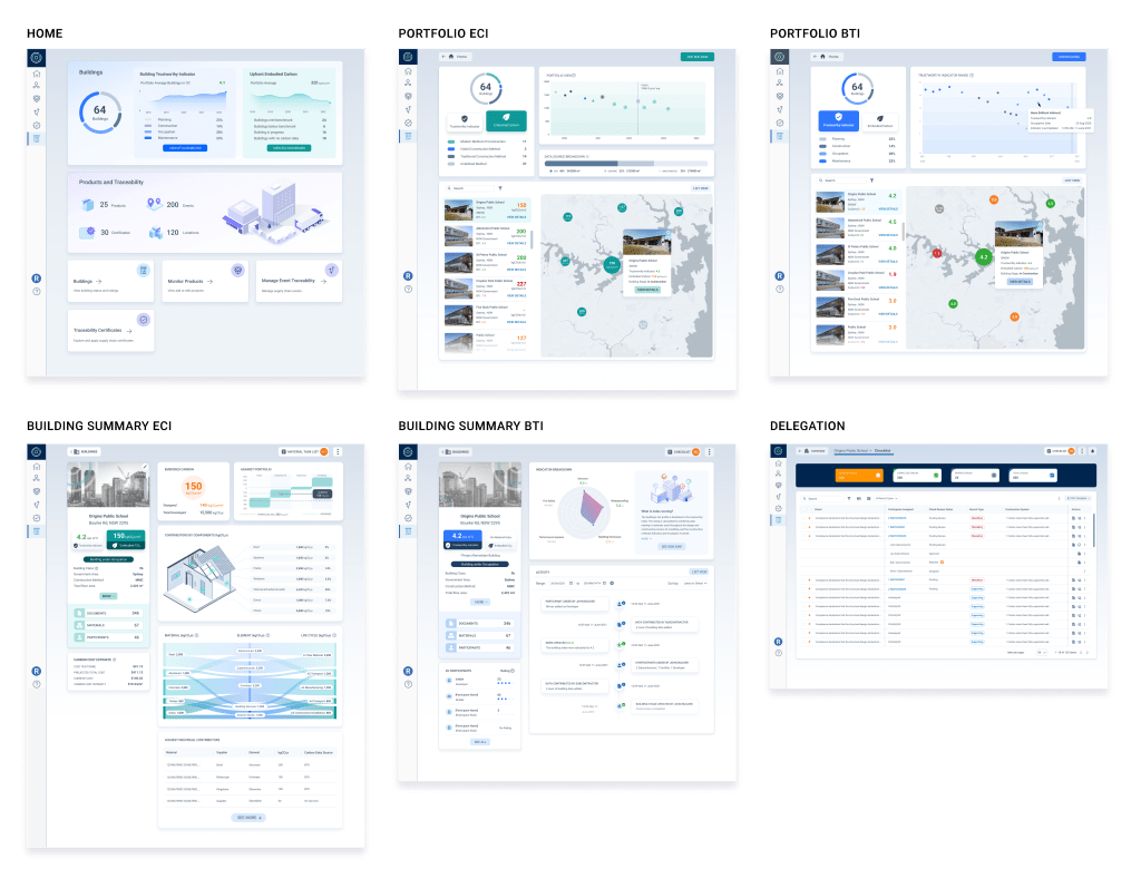
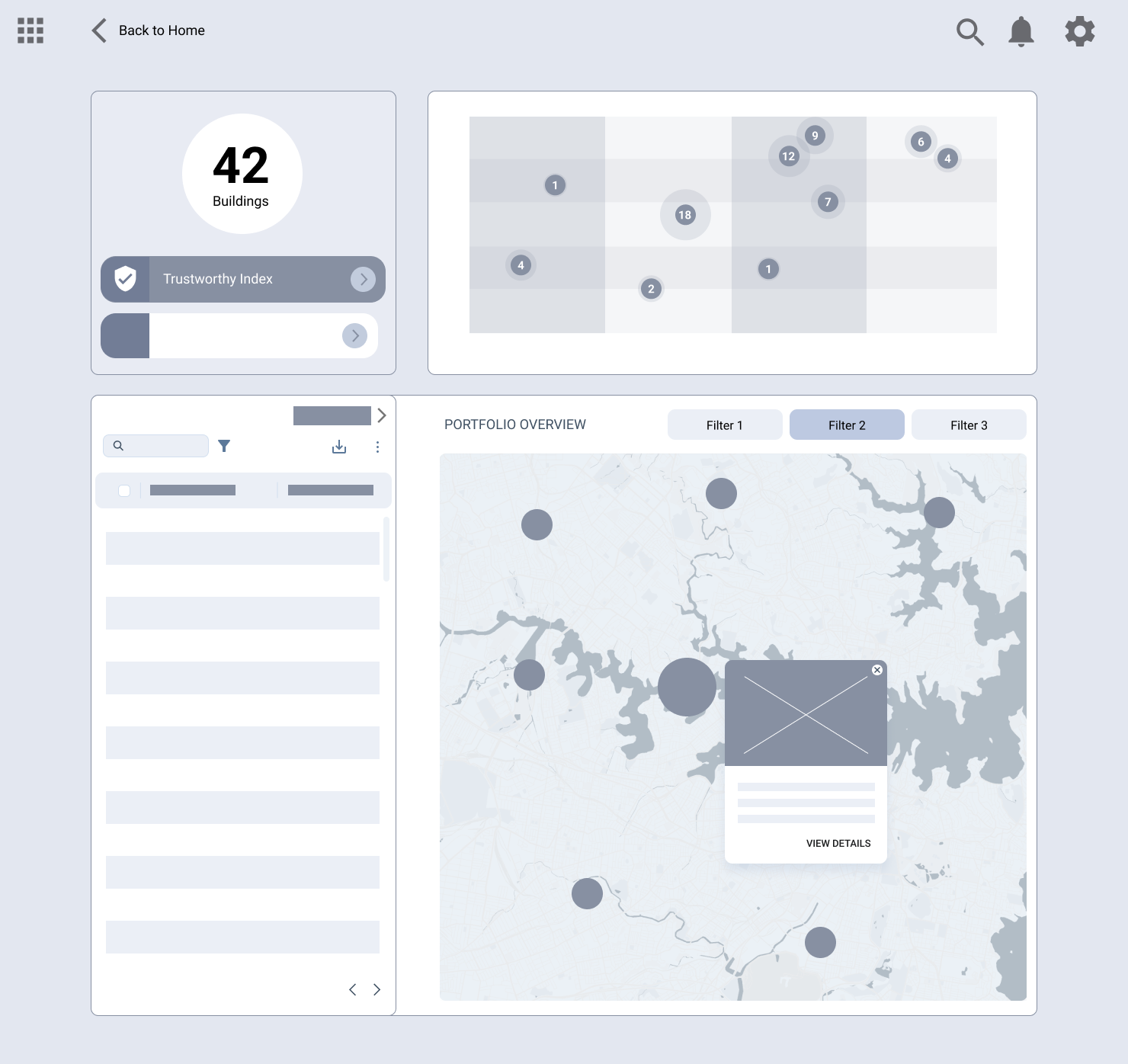
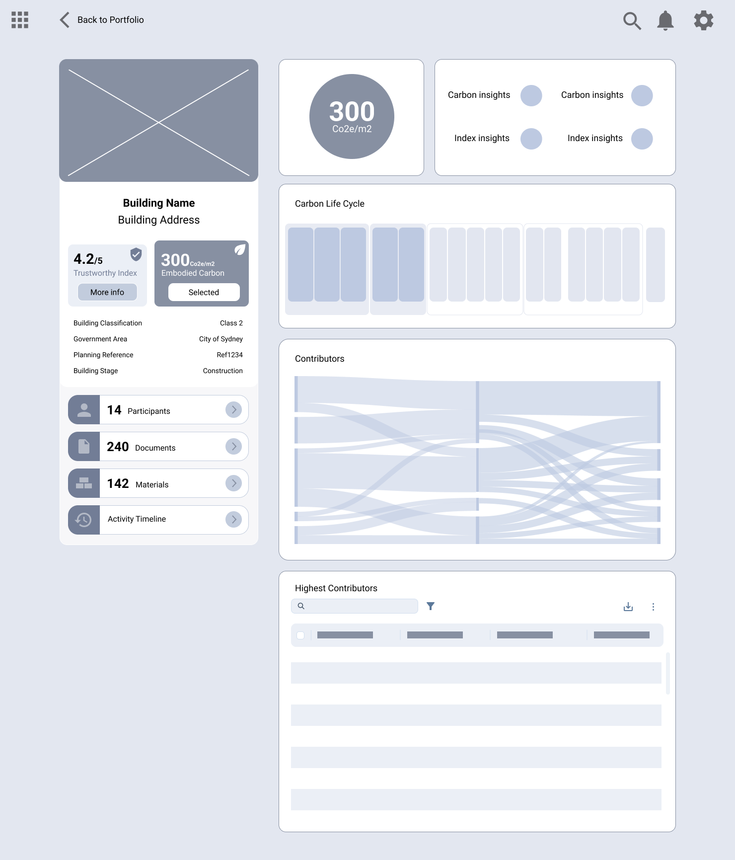
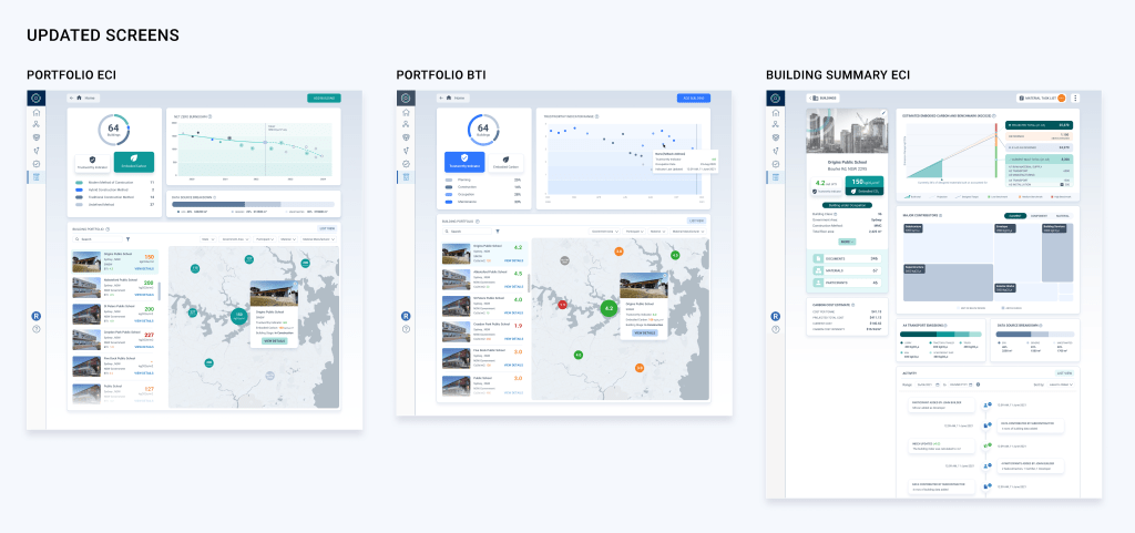
Over the course of 2 months we worked closely with users to refine the data being shown in the initial high fidelity screens and there were many changes suggested both major and minor. For example the building summary page dashboard didn’t resonate too well with users. While some were pleased with the visual elements, not having seen data represented this way before, it actually didn’t add much value and in some cases even detracted from what was being shown. There was a need for a way a user can easily break down the main contributors of the building emissions so we settled with replacing the Sankey chart with a tree map.
The benchmarking and presentation of total emissions was also not the best having no value during the construction phase and users want to be able to make adjustments based on the trajectory of their build. This brought about our projection calculations, giving the user the ability based on the built materials, where the building is compared to design.
In the portfolio pages we used the projection data to turn the graph into a net zero burndown chart predicting where your portfolio falls in terms of your net zero targets. Adding filters on. To the map also gave it more data to collect by allowing the user to compare areas as well as which buildings contained certain materials helping with defect tracking.
Handover
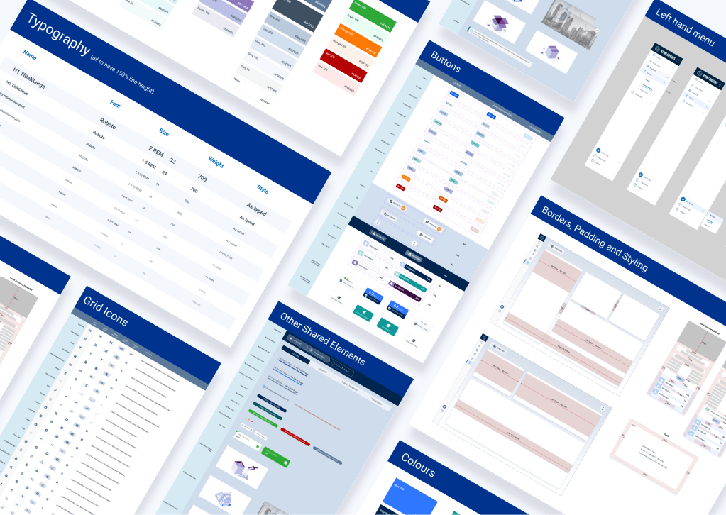
Handover to the developers, was a little different to usual projects, due to the expansion of the scope from product design to also navigation and UI update, I built a design system to support the new designs. Using Figma components, the devs created these into reusable components on storybook using the Atomic design Methodology.
Next steps
Having MVP built and delivered to the government, we will move on to the next phase of wider scale validation and improvements throughout the system. Our key focus areas are in data entry, having already received complaints even though there is delegation, deriving more value from the portfolio pages, as well as connecting the product deeper into our track and trace platform to have a more in depth ecosystem of players and data alike.
